// L01 — Enterprise Brand Transformation
Beacon Health Options → Carelon
Transforming an enterprise brand through organizational change.

// The brief
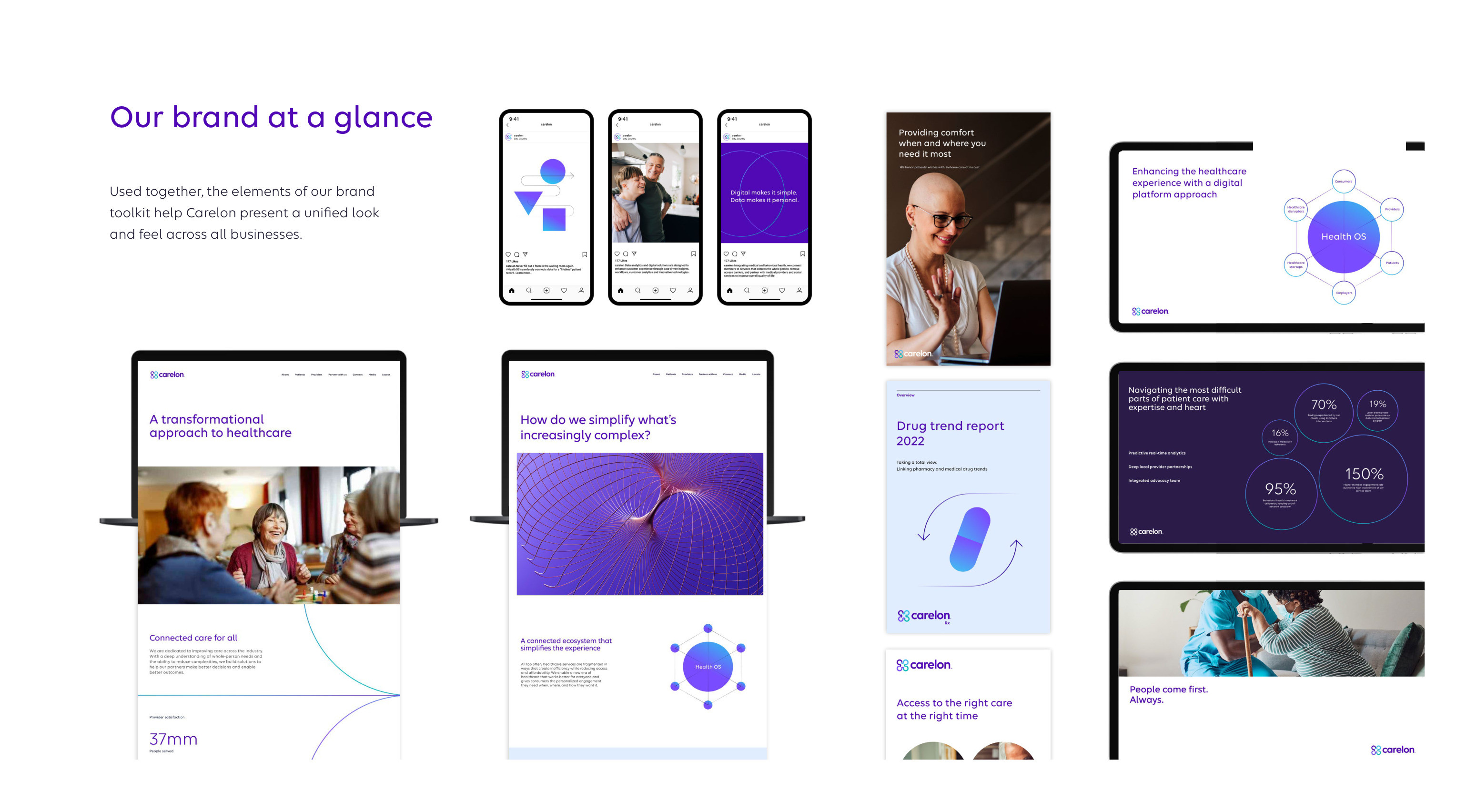
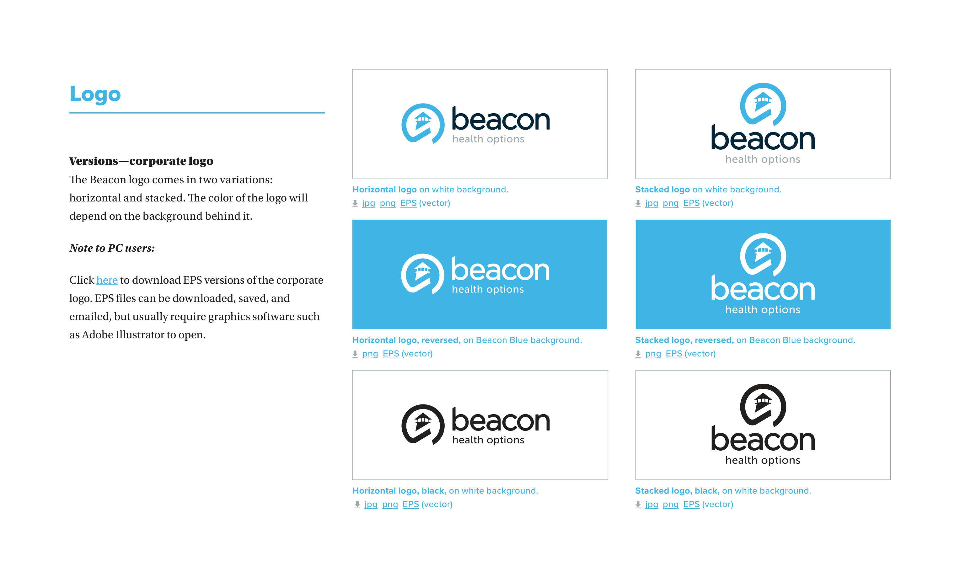
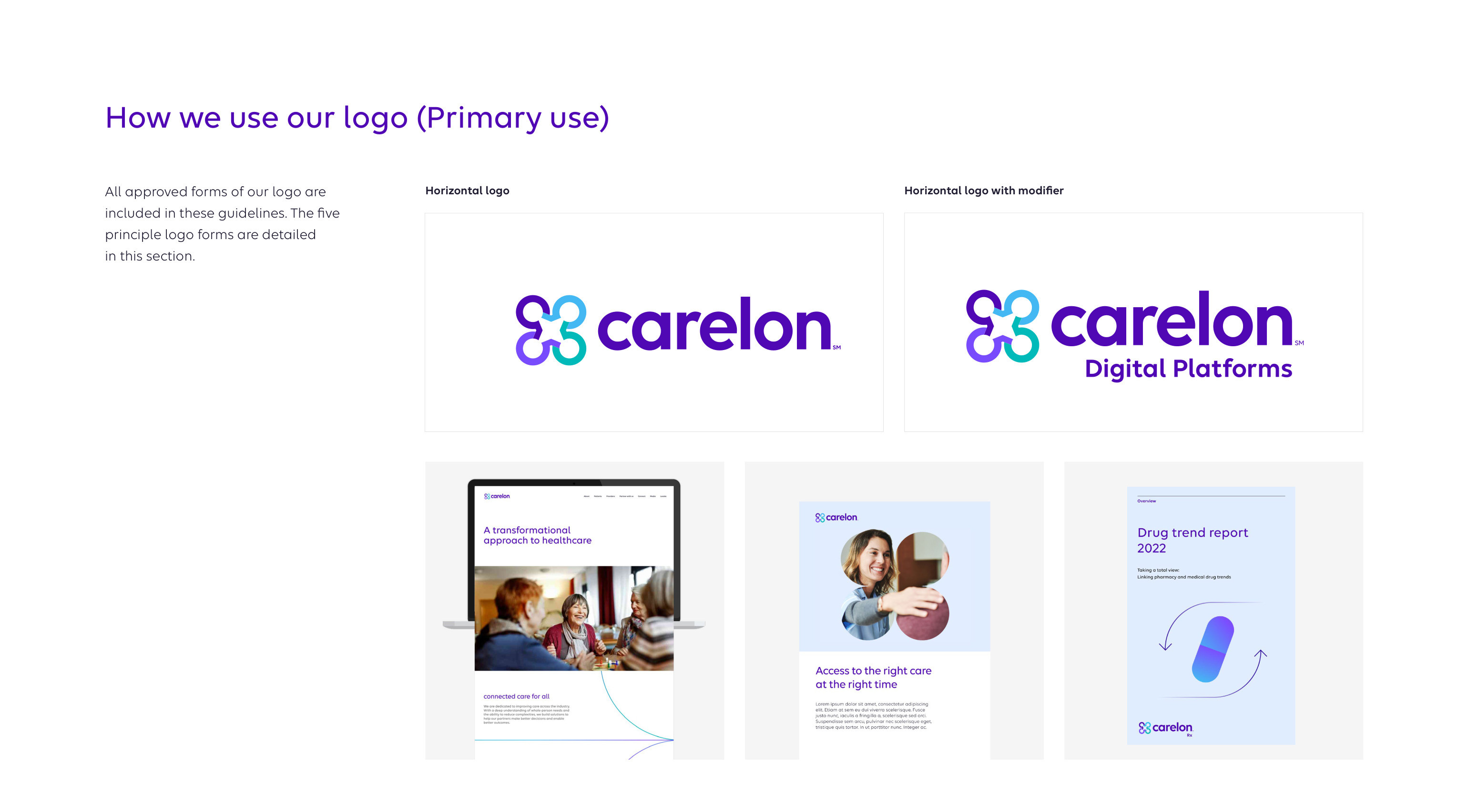
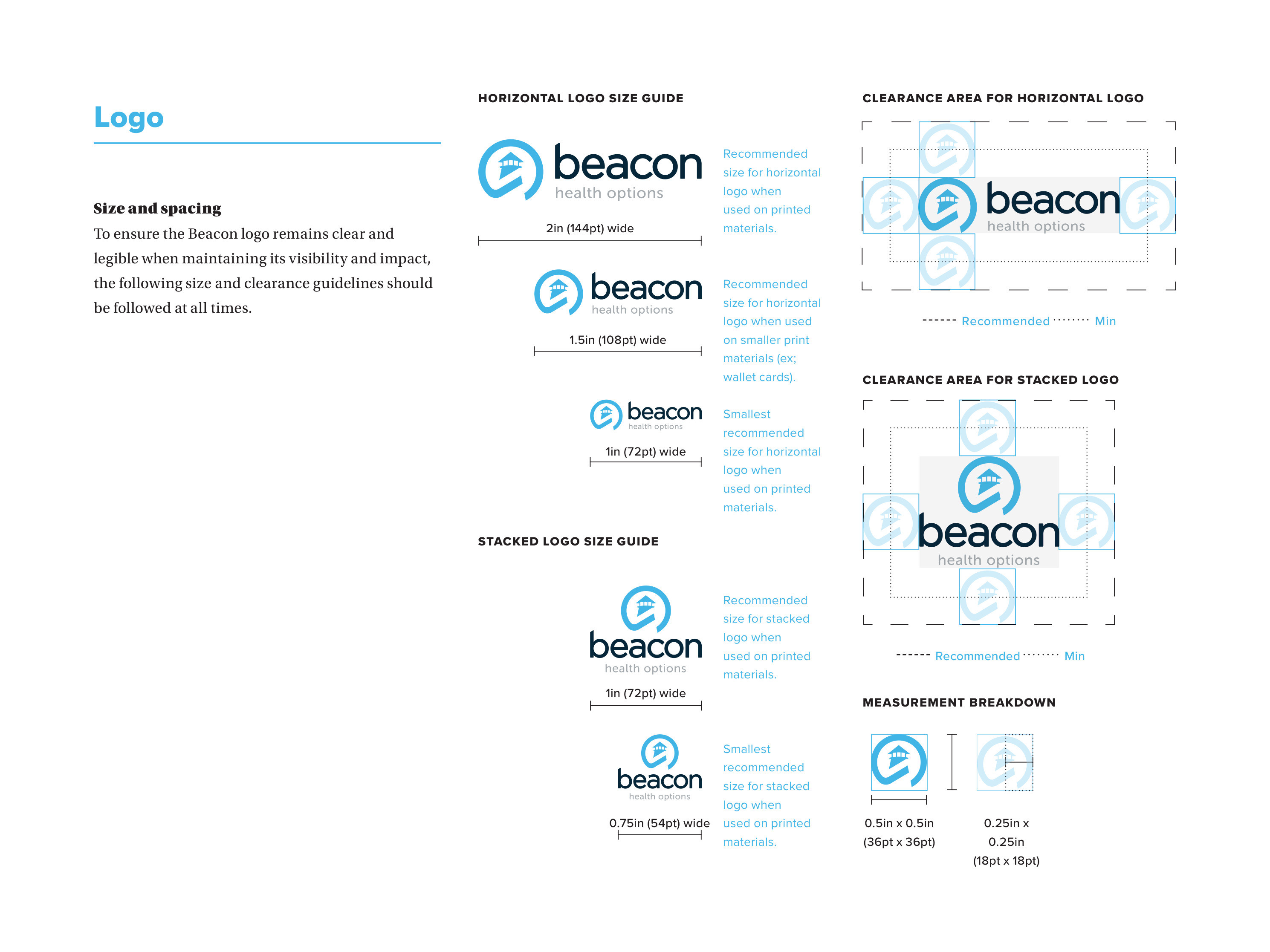
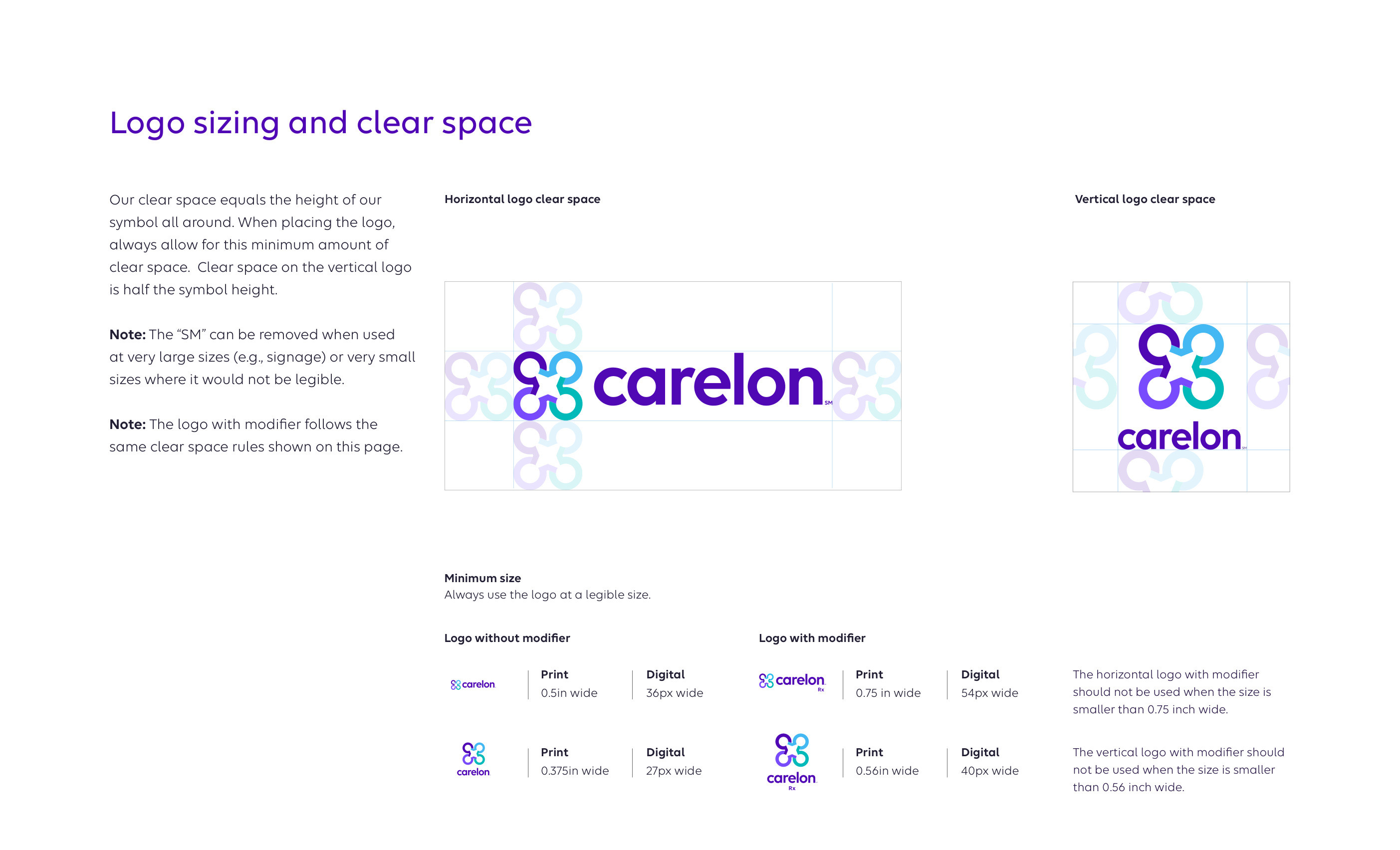
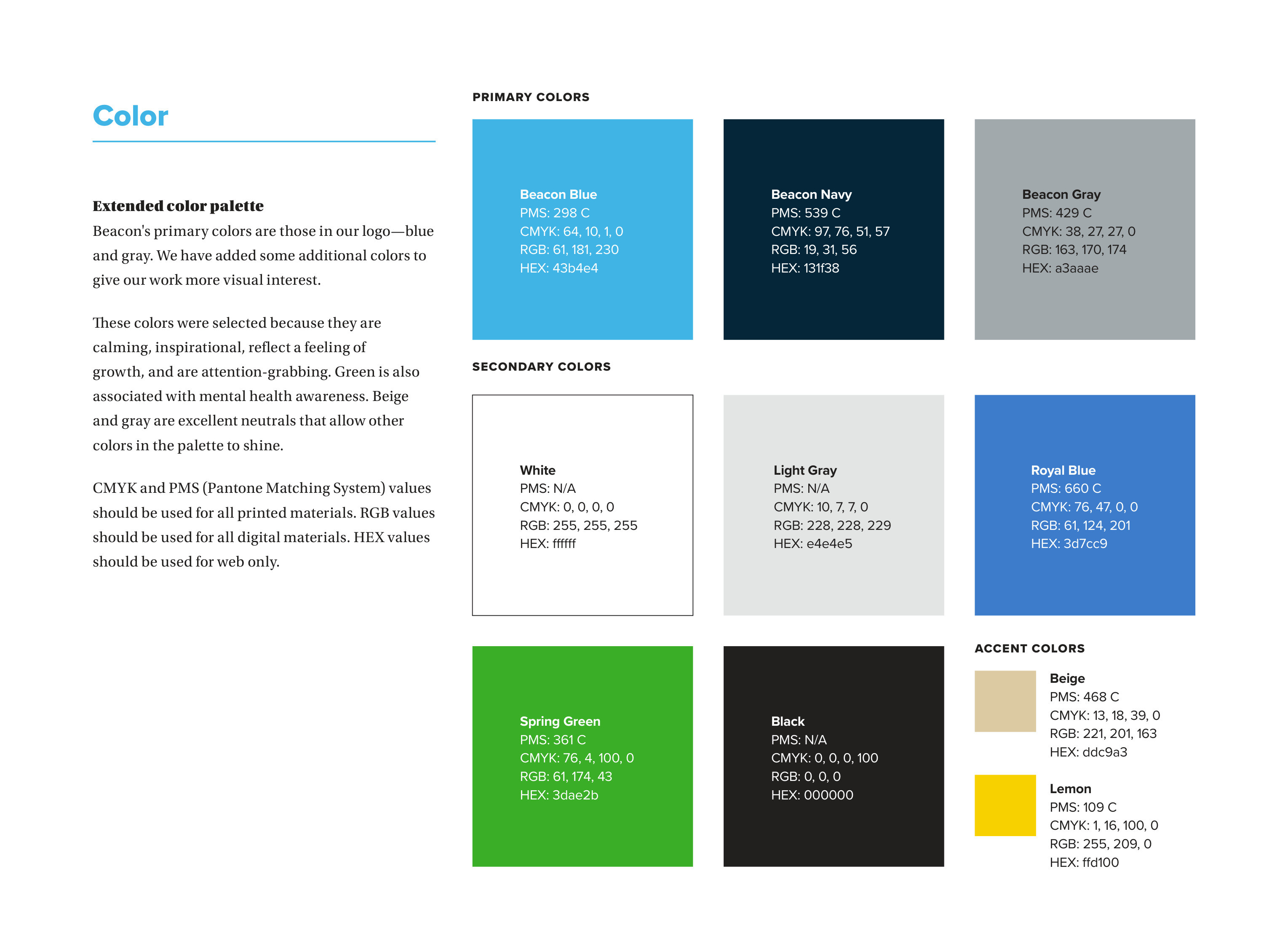
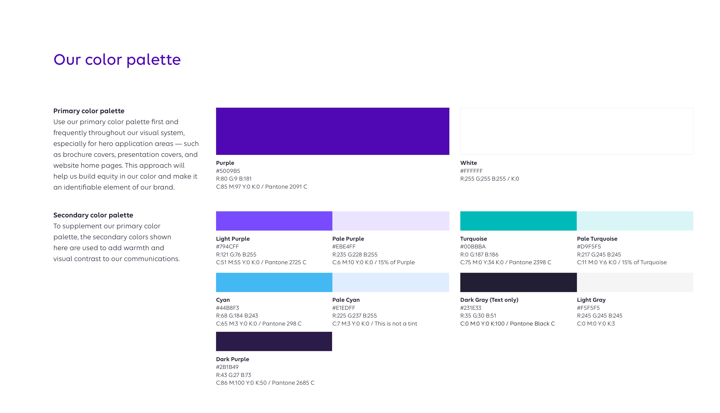
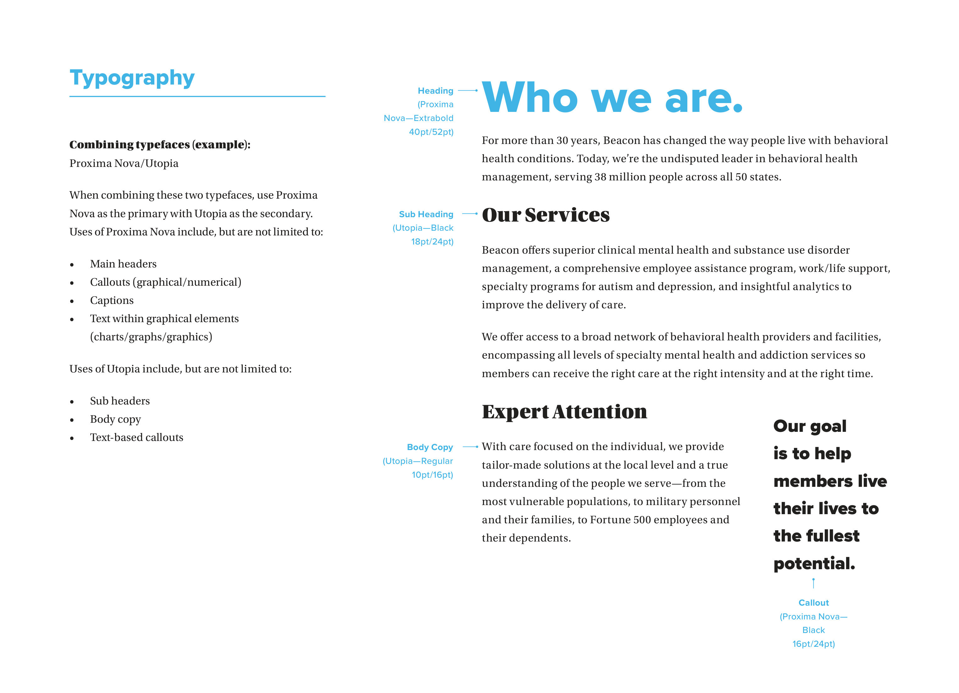
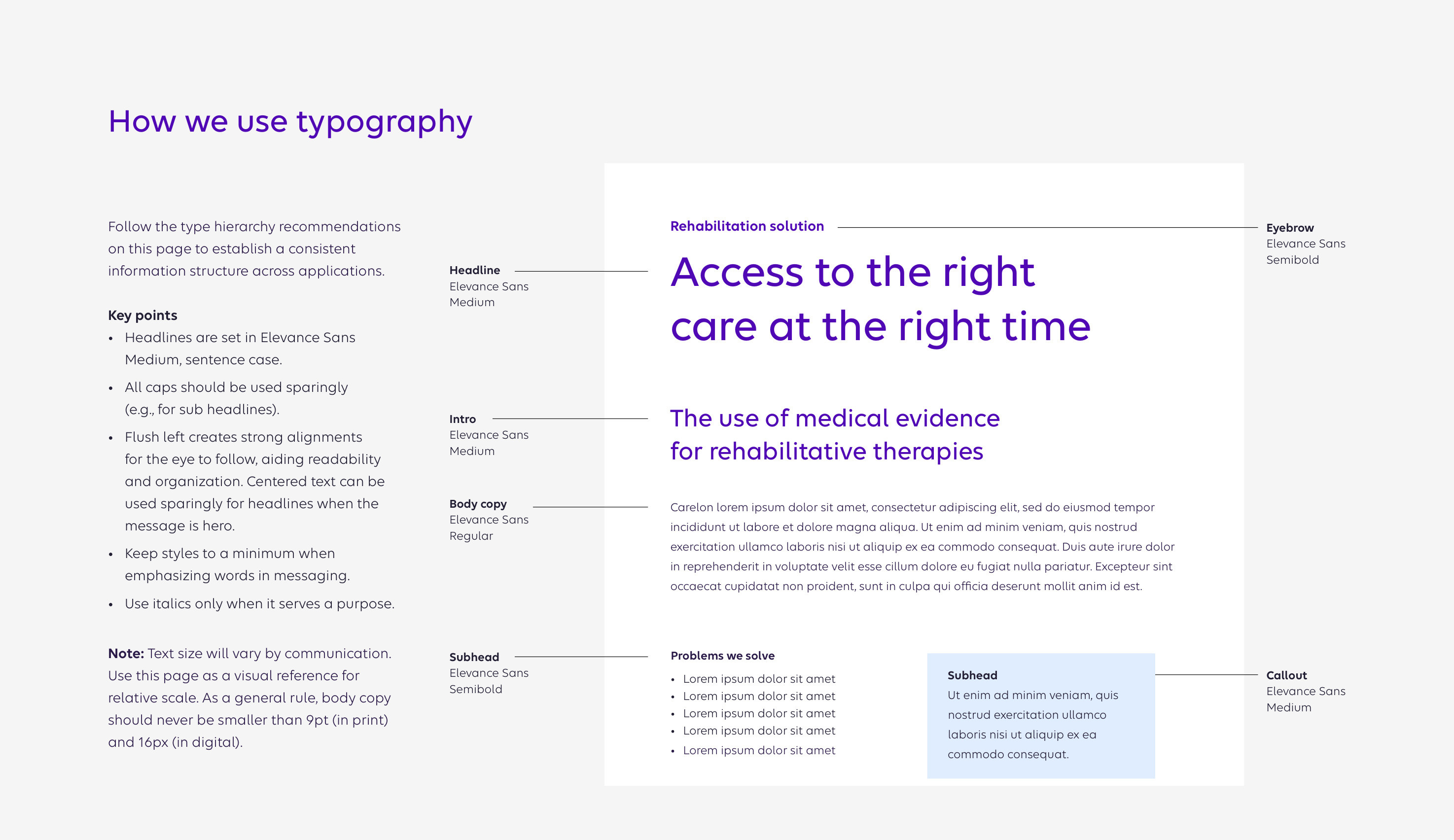
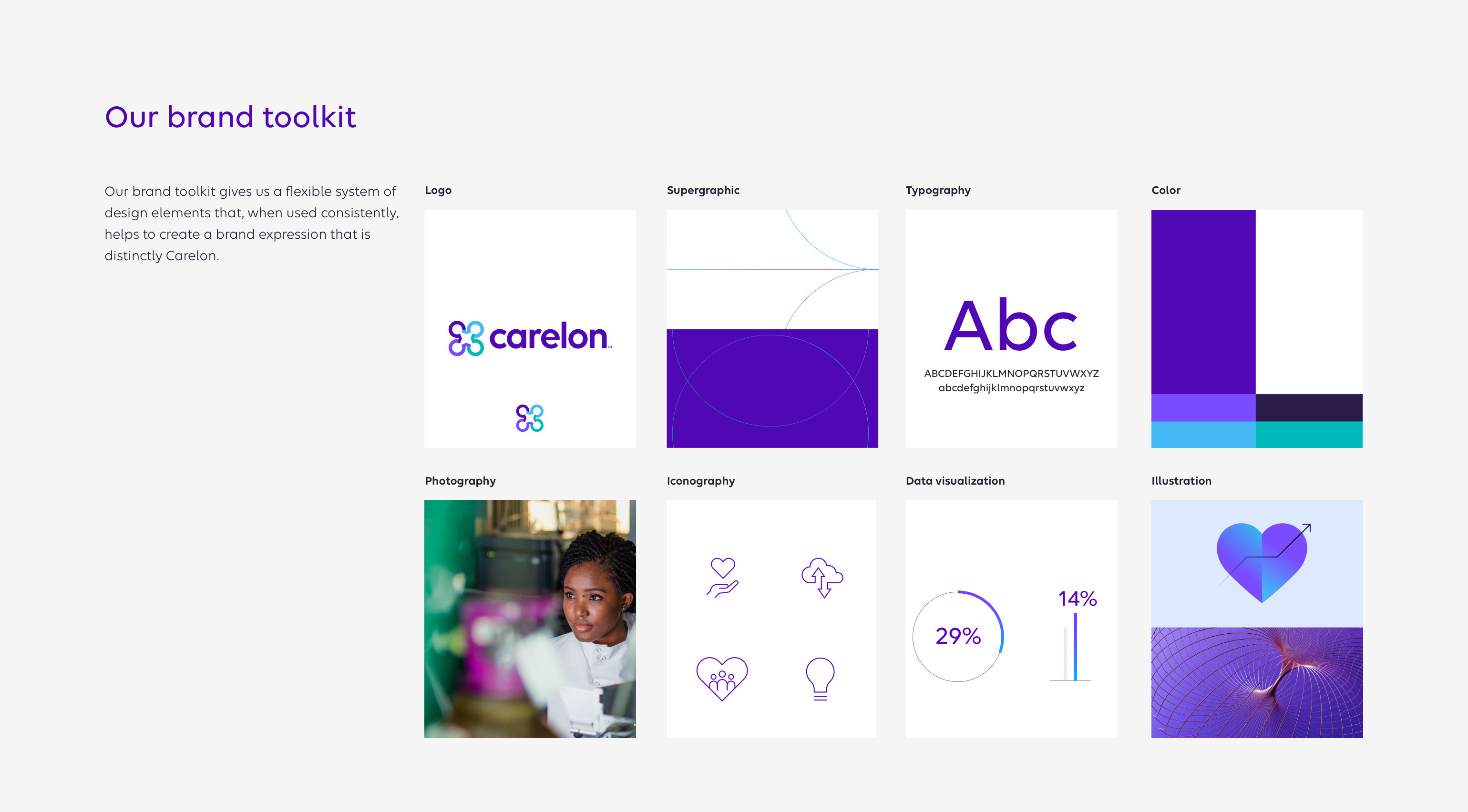
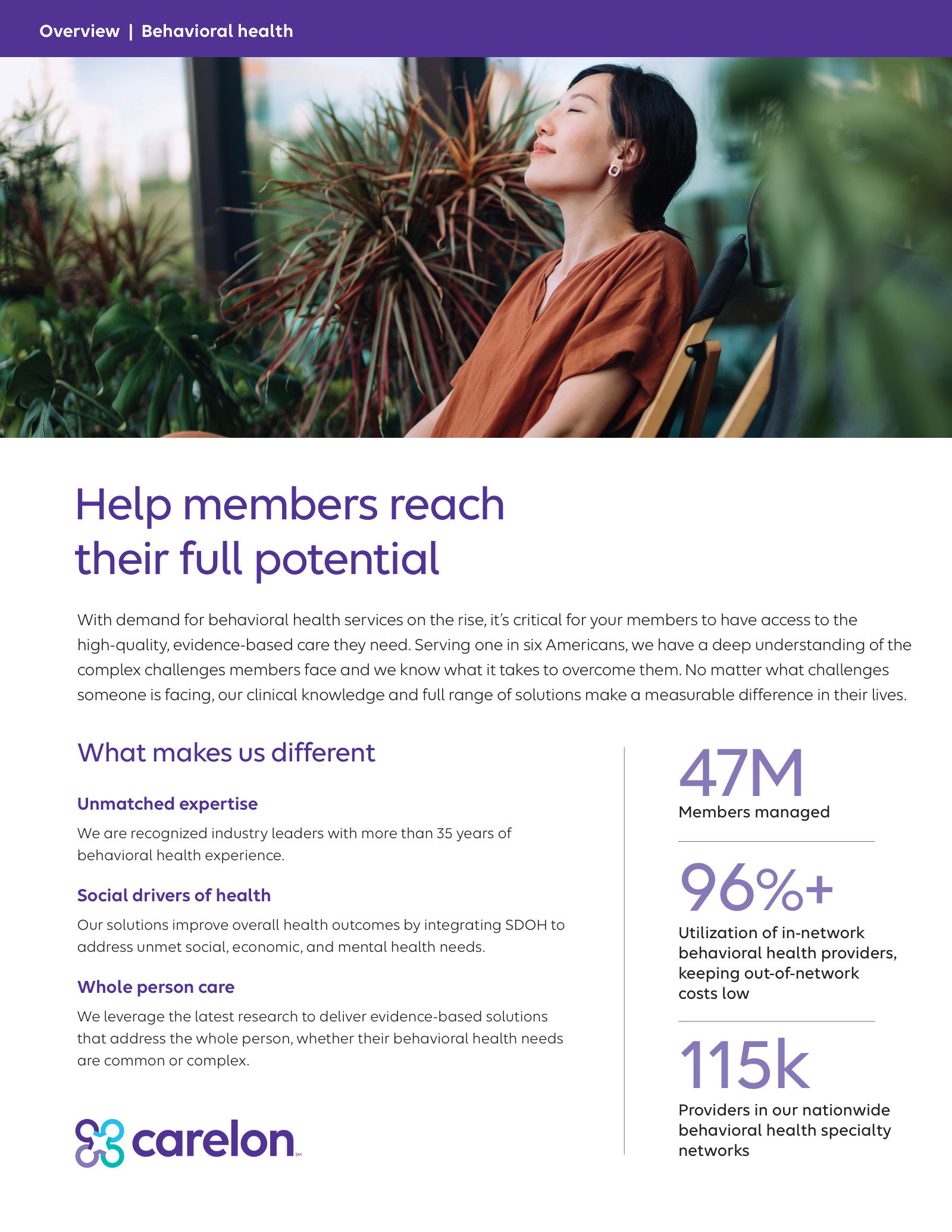
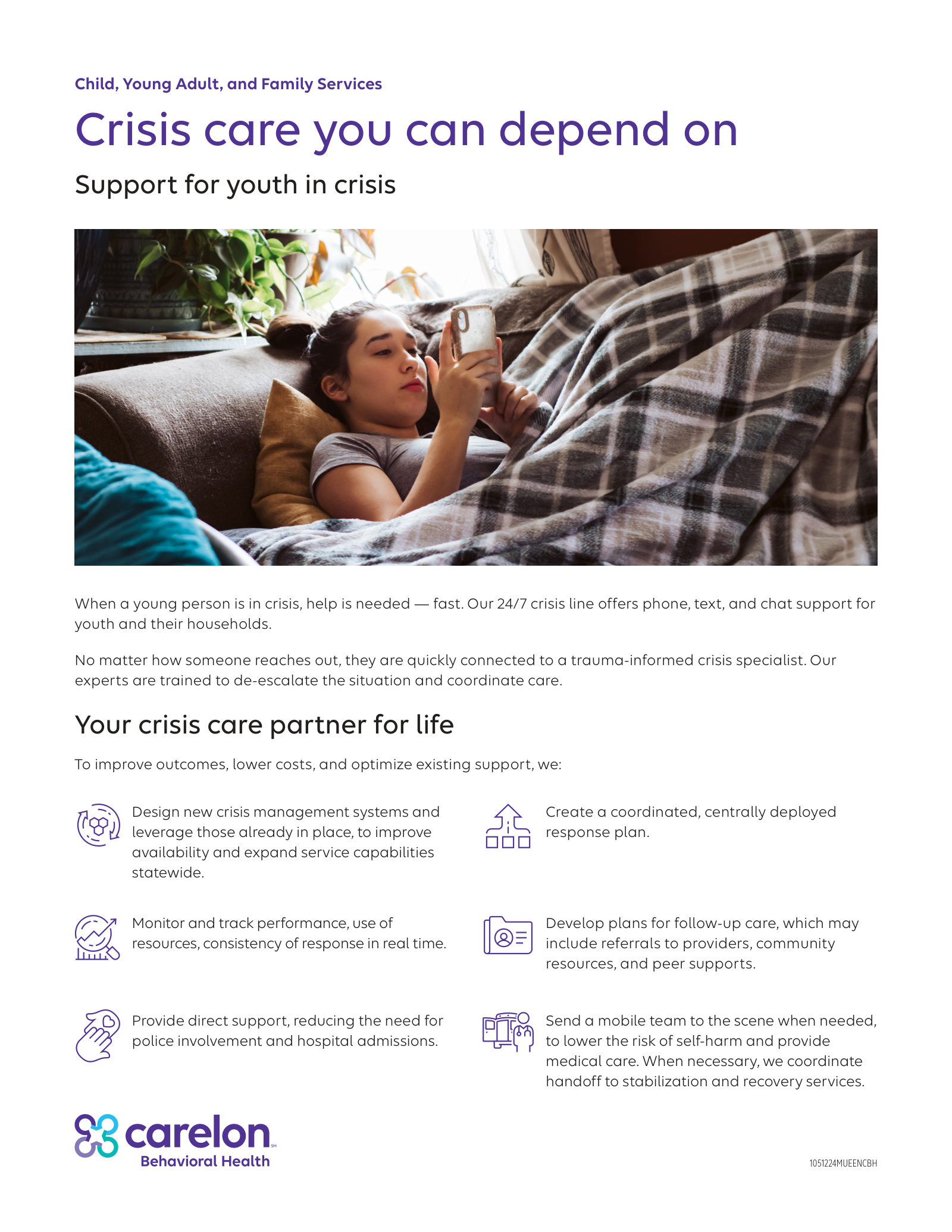
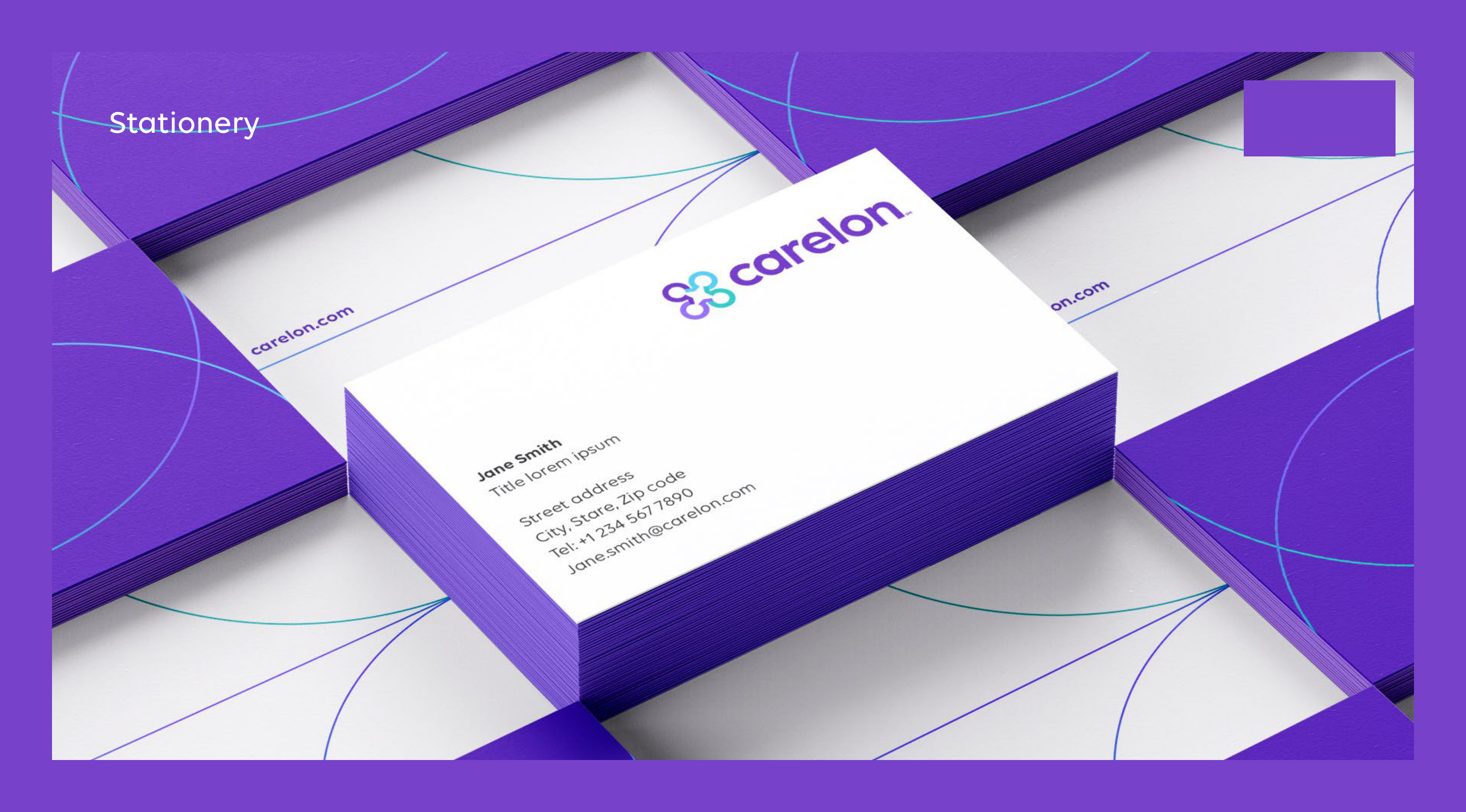
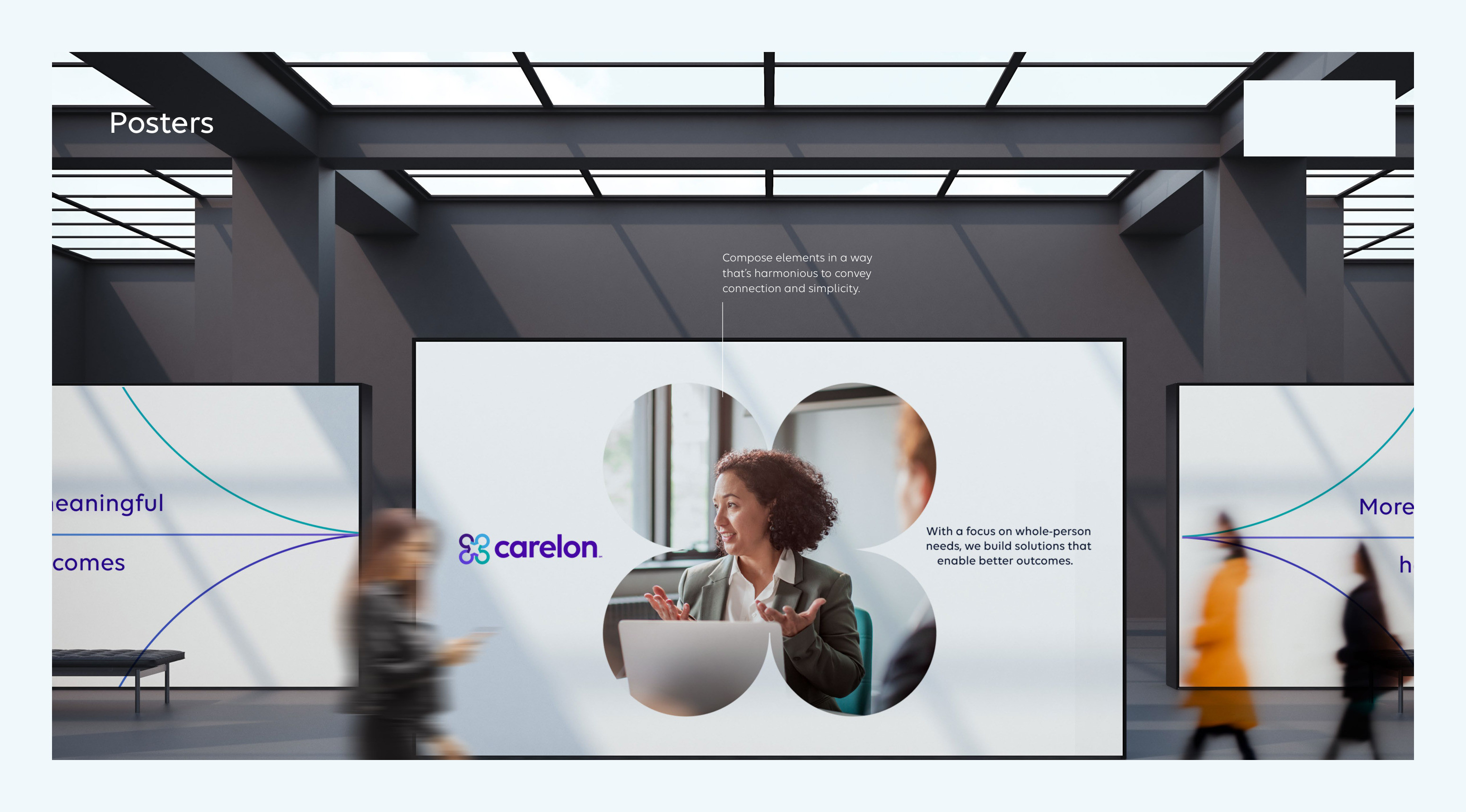
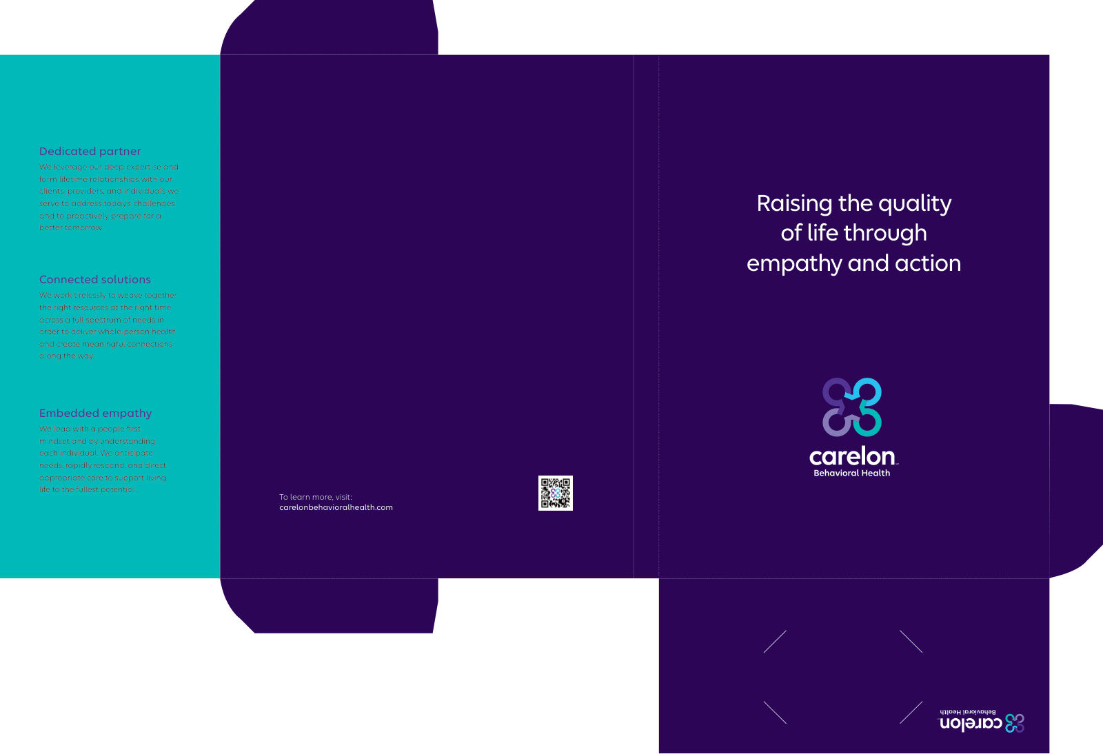
When Beacon Health Options was acquired and folded into Carelon and Elevance Health, roughly 1,500+ brand assets had to move to a new identity across an ~85,000+ employee organization — without disrupting the people who depend on them. The identity itself arrived from the enterprise as a 115-page brand system. My job was the harder half: translating it into Carelon Behavioral Health's own materials, building the templates the work would run on, and controlling quality as a team of twenty produced against them.
// The challenge
An acquisition meant a national behavioral-health brand had to migrate to a new identity across a very large body of existing work — while the audience (members, providers, and internal teams) kept relying on those materials every day. The risk wasn't just visual inconsistency; it was eroding trust during a period of organizational uncertainty.
Enterprise healthcare adds real constraints — compliance and legal review, accessibility requirements, legacy templates and systems, many stakeholder groups, and tight timelines. Decisions had to survive executive review while staying usable for the teams producing day-to-day work.
// The work
// The mandate
As Creative Director, I led the transition end to end on the Beacon side: reading the enterprise brand system into Carelon Behavioral Health's design system and templates, directing vendors and partners, rebuilding merchandise, and standing up a print-on-demand platform from scratch — everything between the guidelines and a finished piece in a member's hand.
// John's role
- ↳Translated the enterprise brand system into Carelon Behavioral Health's own guidelines and application rules
- ↳Built the design system first, then the templates the work would run on
- ↳Directed vendors and partners; rebuilt merchandise and the print-on-demand platform end to end
- ↳Managed 3 in-house designers, a video production artist, and a team of project managers and writers
- ↳Ran a near-daily cadence and a live progress dashboard to keep hundreds of deliverables on track
Worked with
- ↳3 in-house designers
- ↳A video production artist
- ↳Project managers and writers
- ↳Creative Circle freelancers — the team scaled to ~20 people across the year
// Key decisions
Build the system before the assets
The enterprise handed us the identity — logo, palette, type, supergraphics, imagery rules. Rather than migrating piece by piece, I built the Behavioral Health design system and templates on top of it first, then produced against them. Slower to start, but it made ~1,500+ deliverables repeatable and consistent as volume spiked.
Batch the work to make it finishable
Hundreds of deliverables are overwhelming as one list, so we batched them by type of piece, client, and product and worked through them in waves — steady, measurable progress instead of drift.
Scale the team, and keep it in sync
We brought in Creative Circle freelancers, scaling to ~20 people, and held it together with near-daily check-ins and a shared progress dashboard so everyone could see exactly where things stood.
// The outcome
- ↳~1,500+ brand assets migrated to the new identity across the organization
- ↳Merchandise and the print-on-demand platform rebuilt end to end
- ↳The full rebrand delivered in ~9 months with a team that scaled to ~20
// Reflection
What I'd change: stand up a single shared project-management system from day one so everyone stays on the same page and can see progress. What it taught me: hundreds of deliverables look overwhelming on paper, but with the right system and the right people, you chip away at it — and finishing something at that scale is its own reward. This is the project that changed how I lead.