// 05 — Website / Editorial
Atrómitos
Their art direction, elevated — and a Knowledge Hub that carries their expertise.
// The brief
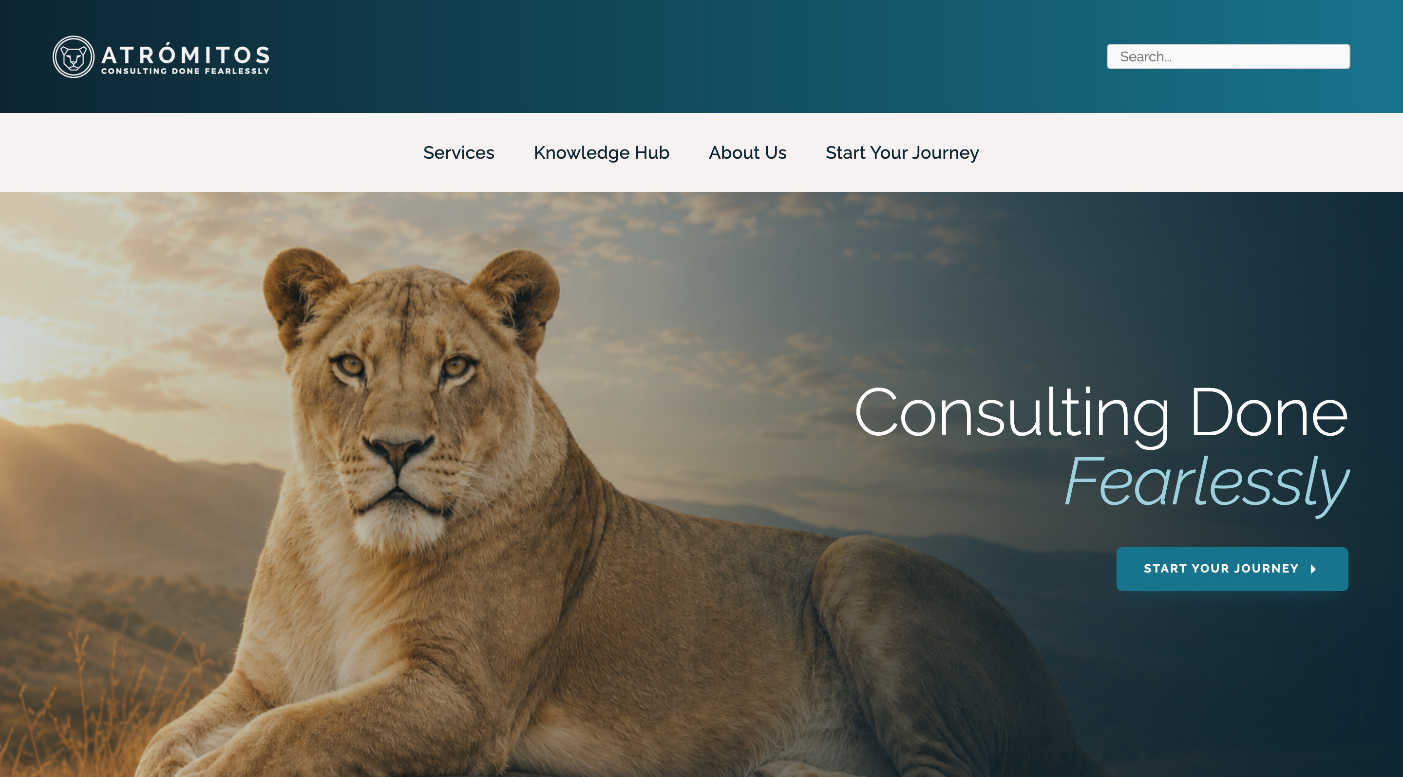
Atrómitos is a woman-owned health and human services consulting firm. They came in through a referral with their own art direction already settled — they weren't looking for a redesign. So the job was to execute their direction faithfully, raise the craft inside it, and add the things that would actually move the business: real interactivity and a consolidated Knowledge Hub for their published work and webinars. The Andy Hill CARE Fund report was a separate commission.
// The challenge
Atrómitos arrived with the site already laid out the way they wanted it. The art direction was theirs and it wasn't up for redesign — so the usual lever, rethinking the look, was off the table. The real problem was underneath it: their published work — articles, policy analysis, podcasts, webinars, toolkits — was scattered, and the site didn't do justice to how much expertise the firm actually produces.
A referral from a completely unrelated client — a good sign the reputation travels. An active, engaged consulting firm that publishes constantly, with a settled visual direction of their own and clear opinions about it.
// The work
// The mandate
Execute their art direction faithfully, sharpen the craft within it, and build what the site was missing: genuine interactivity and one consolidated home for everything they publish. The Andy Hill CARE Fund report came in separately as its own commission.
// John's role
- ↳Took the client's art direction as the brief and built the site to it
- ↳Raised the execution — typography, spacing, and finish — inside their direction
- ↳Added interactivity the original layout didn't have
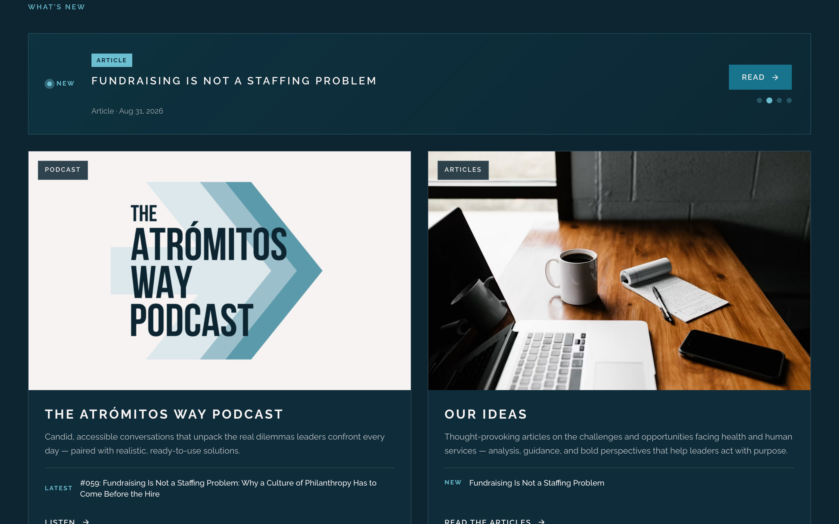
- ↳Designed and built the Knowledge Hub — one consolidated home for their articles, policy analysis, podcast, webinars, and toolkits
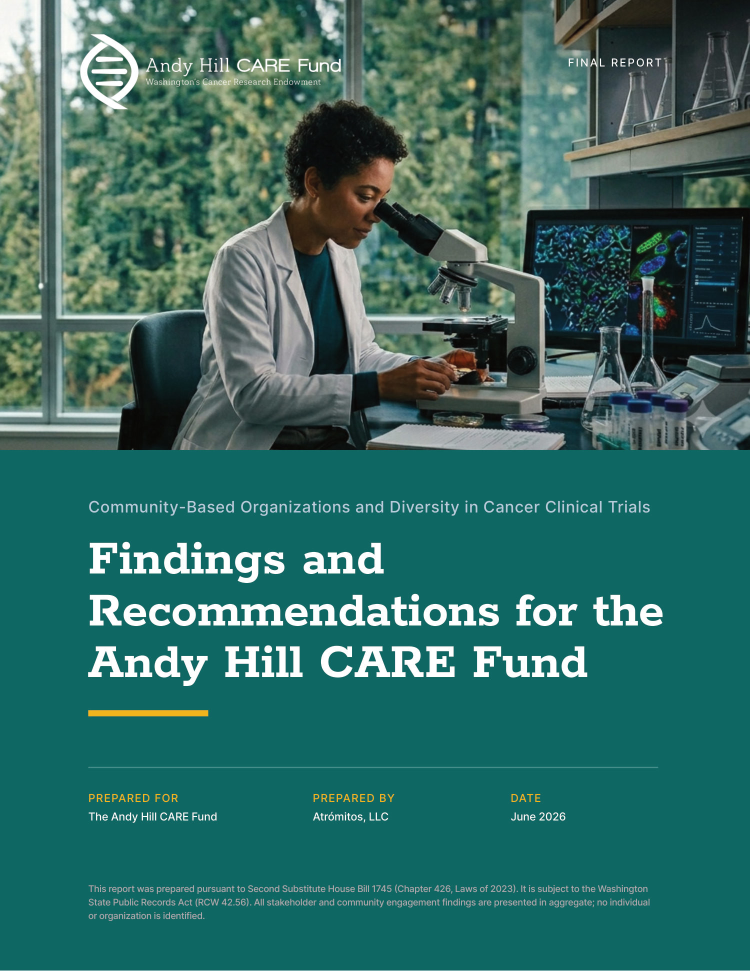
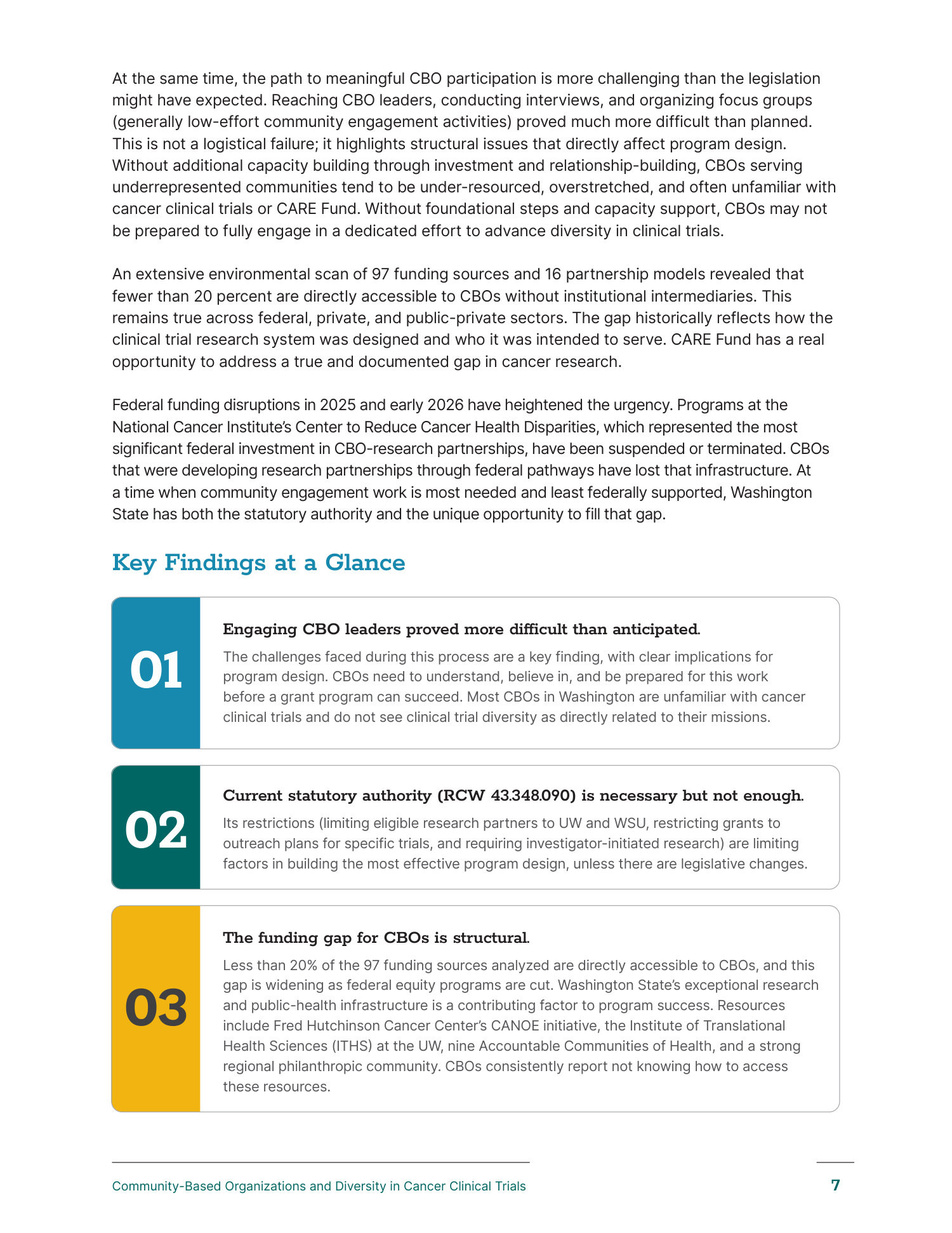
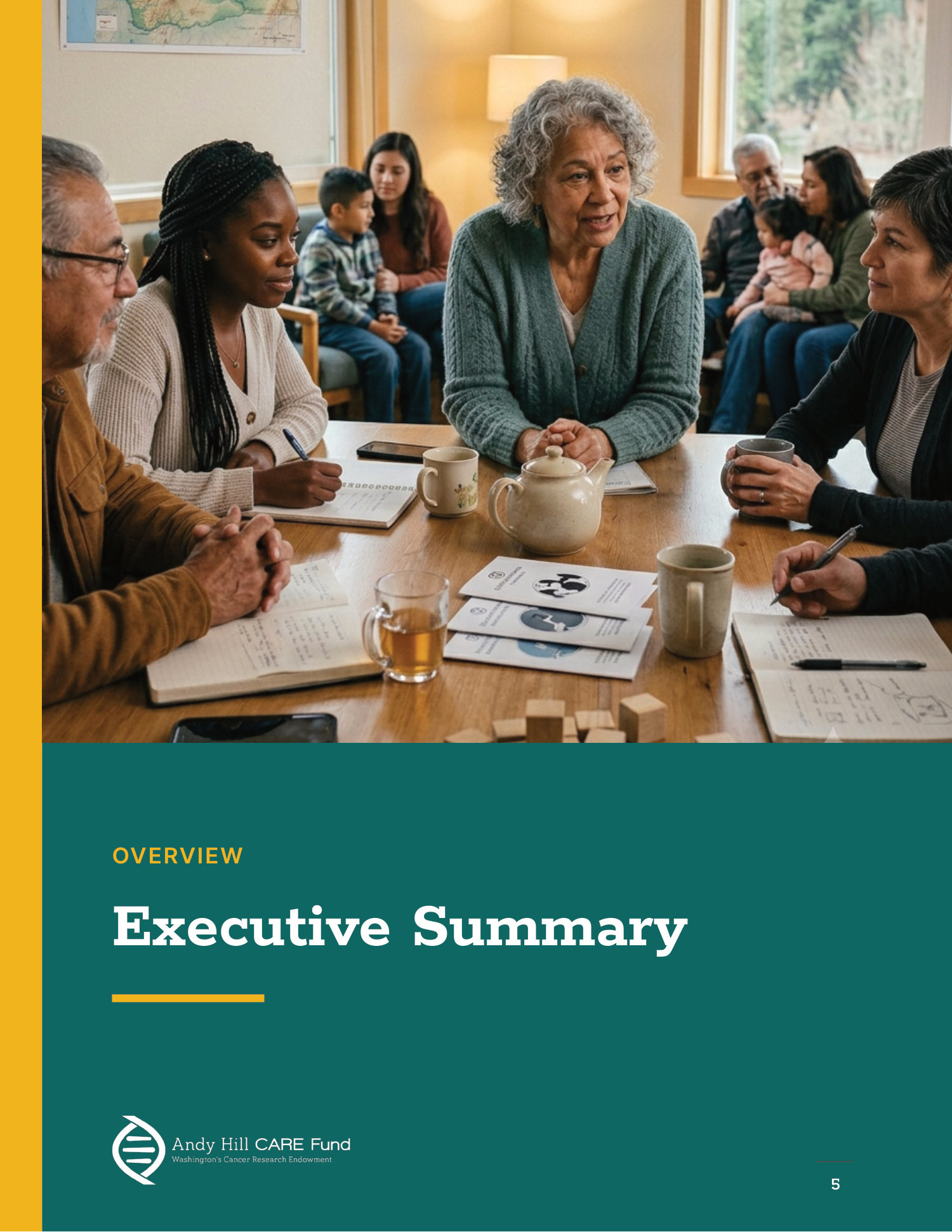
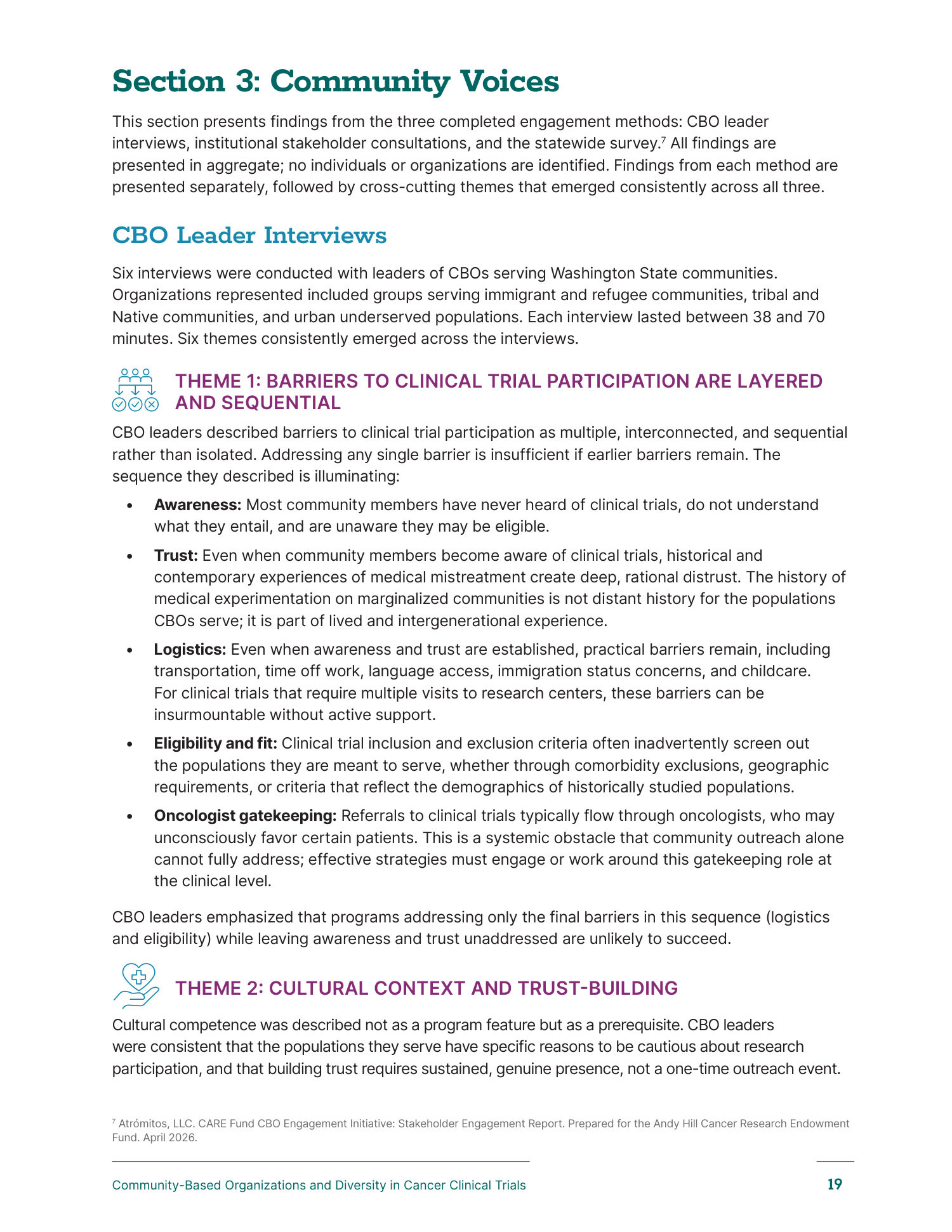
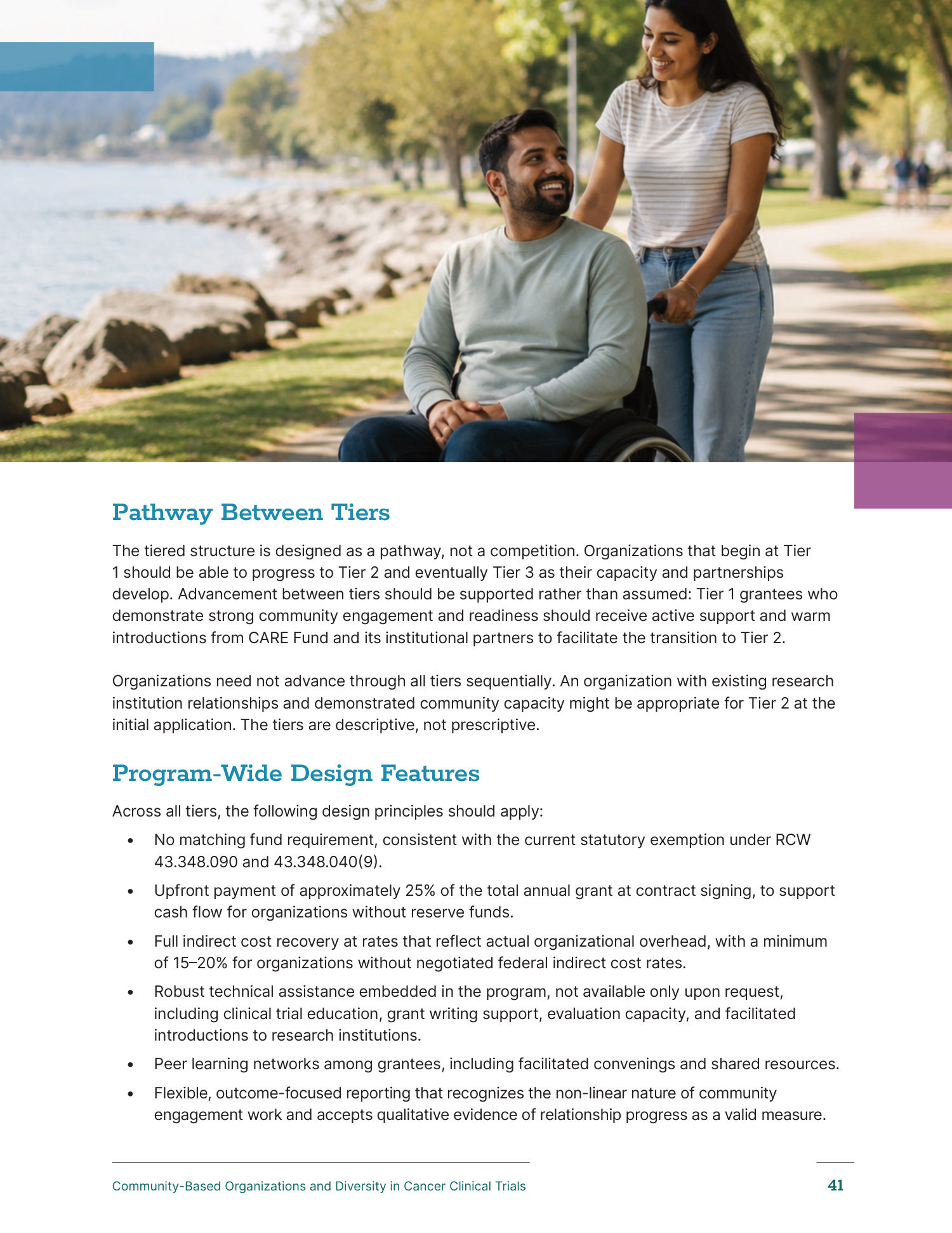
- ↳Designed the Andy Hill CARE Fund report — a 65-page editorial document, commissioned separately
The people behind the work
- ↳Atromitos — woman-owned consulting client
- ↳Referred by another client; a direct client relationship
// Key decisions
Serve their direction — then raise it
The client had settled the art direction and didn't want it reopened. I took that as the brief rather than a fight, and spent the effort where it was still mine to spend: sharper typography, better spacing and hierarchy, and a level of finish above what came in.
Put the value where the direction wasn't
If the look was fixed, the contribution had to come from what the site could do. That meant real interactivity and, above all, the Knowledge Hub — the piece that changed what the site is actually for.
Consolidate the expertise into one place
A firm that publishes this much was spreading it across formats and corners of the site. The Knowledge Hub pulls the articles, policy analysis, podcast, webinars, and practical toolkits into one home, so the depth reads at a glance instead of having to be hunted for.
Treat the report as real editorial
The Andy Hill CARE Fund piece got the full treatment — 65 pages of structured findings, numbered takeaways, section openers, and a tiered recommendation framework. A considered document, not a long memo.
// The outcome
- ↳A site built to the client's own direction, executed at a higher level of craft than what came in
- ↳The Knowledge Hub — one consolidated home for the firm's articles, policy analysis, podcast, webinars, and toolkits
- ↳The Andy Hill CARE Fund report delivered and very well received
- ↳An ongoing relationship with an active, engaged client — more work expected
// Reflection
Not every engagement hands you the visual direction, and this one didn't: the layout was theirs and staying. The useful lesson was where to put the effort when the look is settled — into craft inside their system, and into the Knowledge Hub, which is the piece I'd point at. It came in as a referral from an unrelated client, which tells me the work travels, and it's a relationship I expect to keep building on.