// 01 — Nonprofit / Web Design
Friends Rehabilitation Program
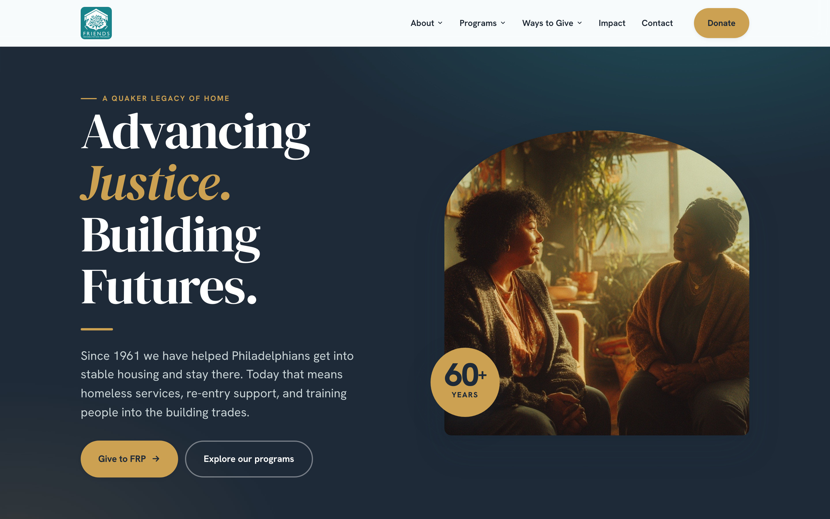
Advancing justice. Building futures.
// The brief
FRP has helped Philadelphians get into stable housing and stay there since 1961. The first pass gave them a calmer, clearer site. The rebuild goes further: a proper editorial identity on the web, programs explained plainly, and a giving experience that works as hard as the mission does.
// The challenge
A Quaker nonprofit that has served Philadelphia since 1961, with a name that no longer describes the work: FRP runs homeless services, re-entry and transitional housing, and trades training, not rehabilitation. The old site was calm and maintainable but it didn't say any of that clearly, and it made giving an afterthought. Visitors — donors, partners, people looking for help — had to work out what the organization did before they could act.
A second engagement, following the first refresh. A mission-driven client with limited technical capacity and a sixty-year story worth telling well. The work is in final review with FRP's team.
// The work
// The mandate
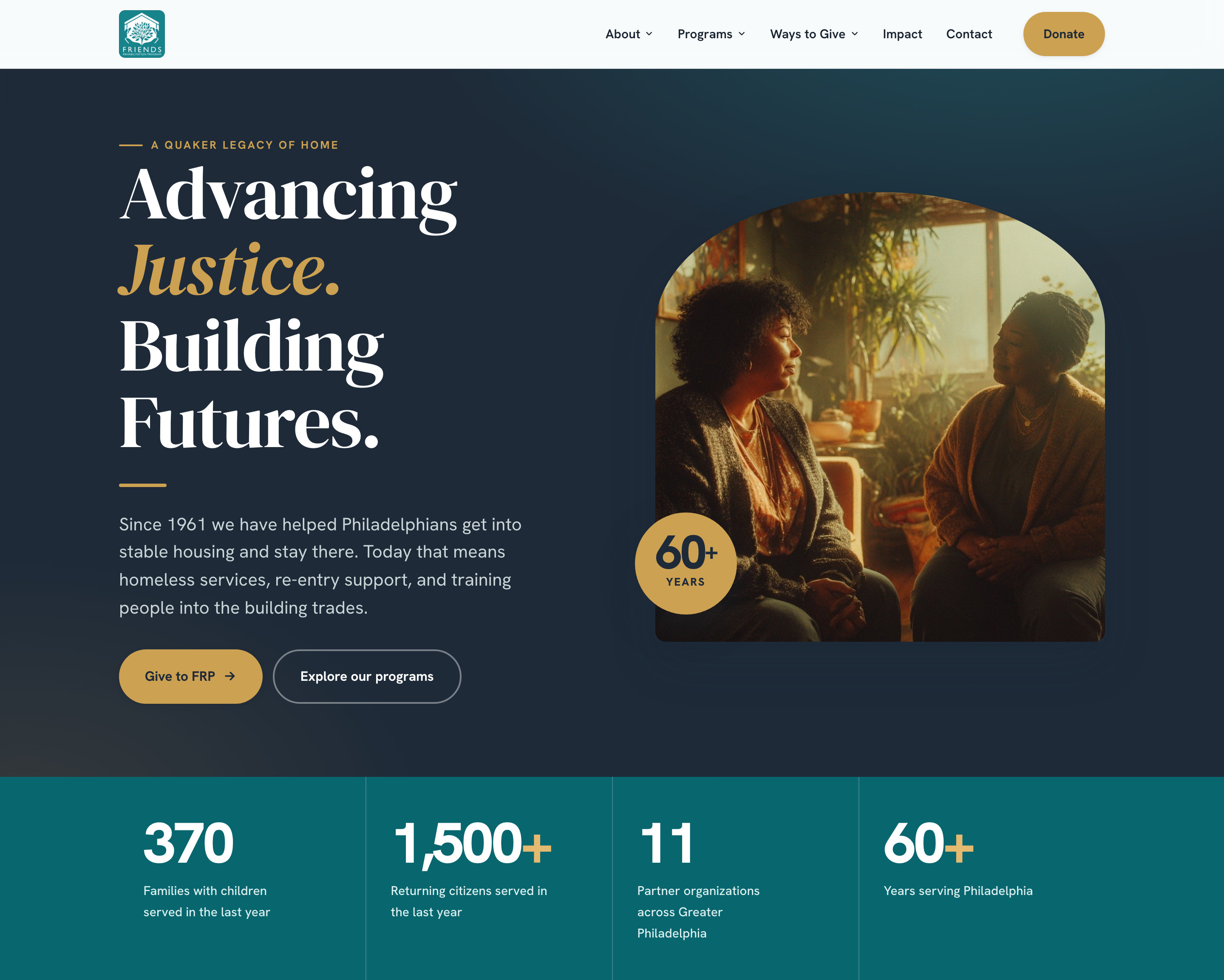
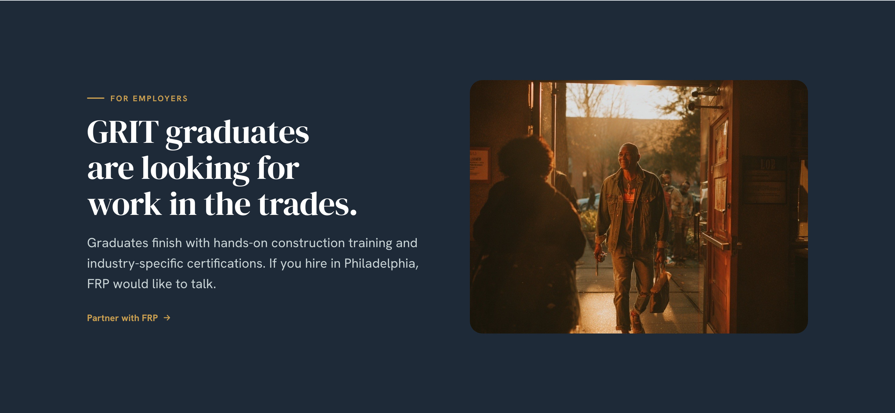
Rebuild the site so the mission is legible in one screen, the three programs and the pathway between them are plain, and giving is a first-class experience with specific things to give to.
// John's role
- ↳Reframed the site around what FRP does — housing, re-entry, workforce — rather than what its name says
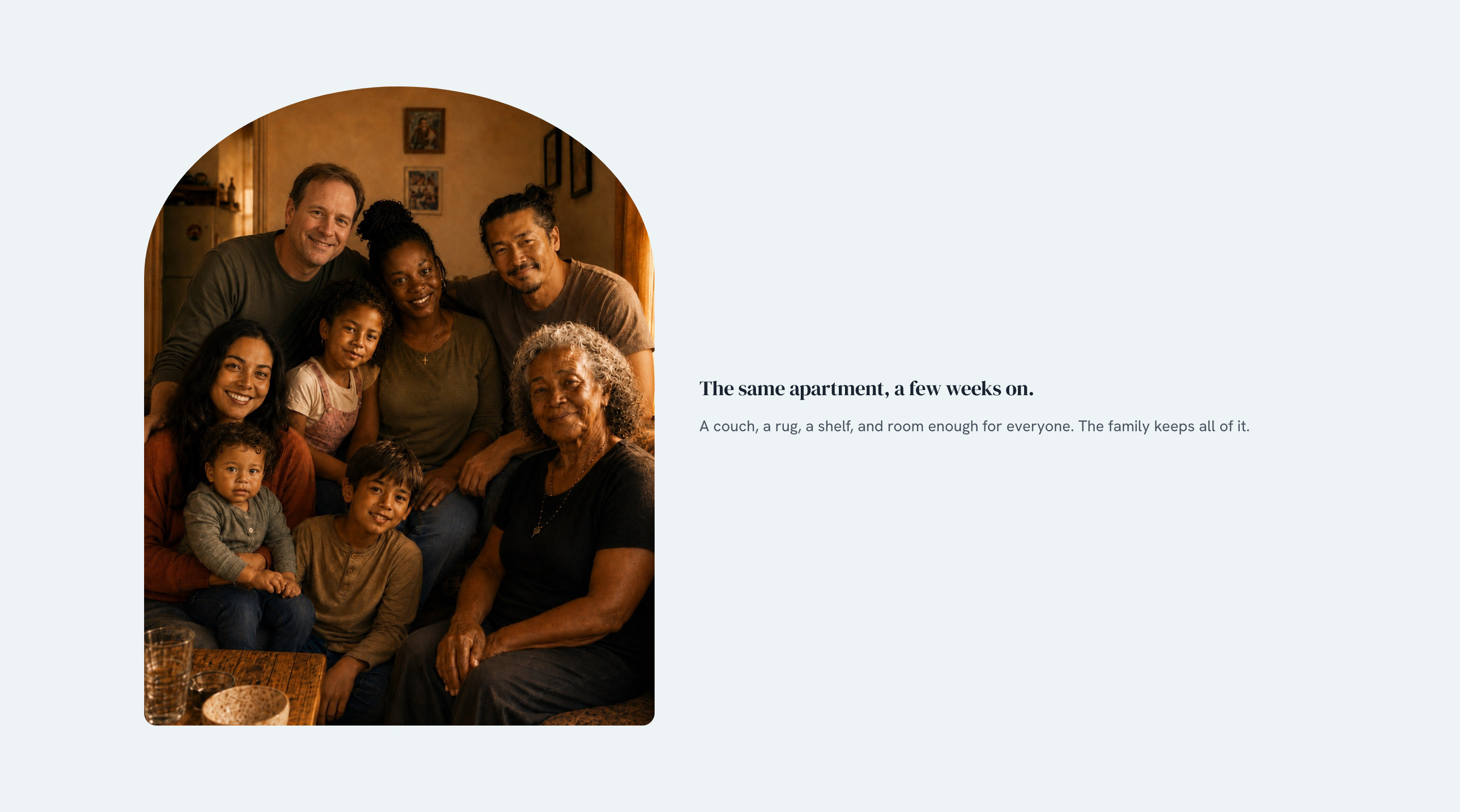
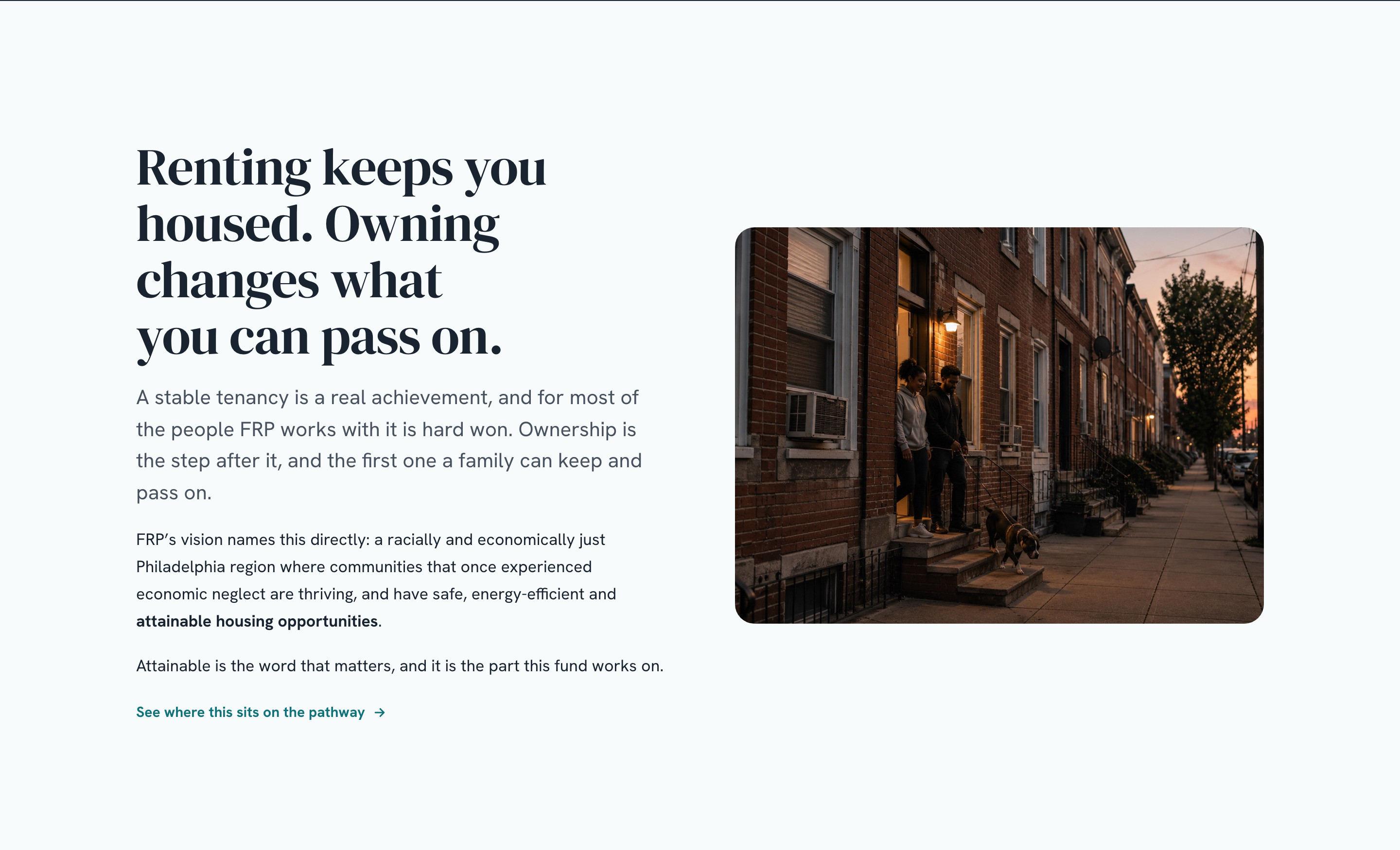
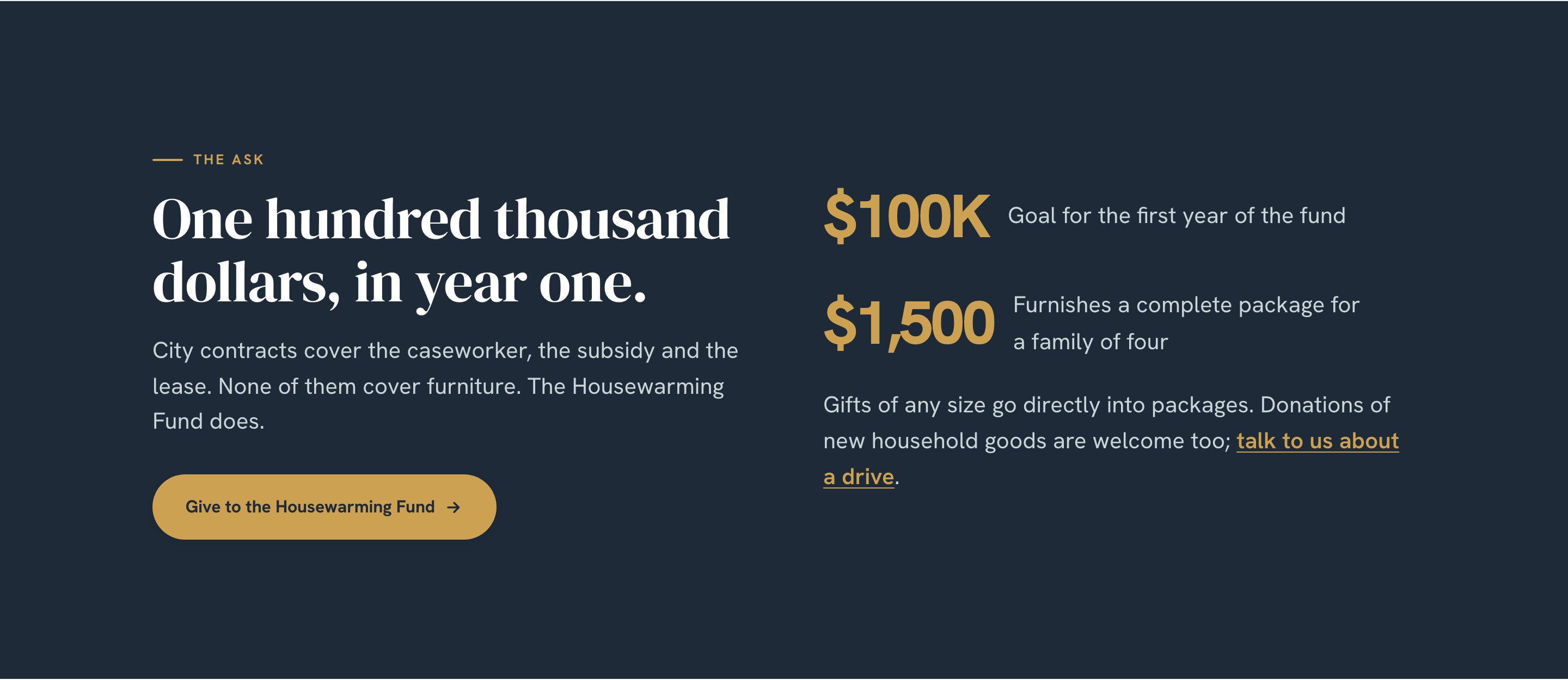
- ↳Designed the identity on the web: navy and gold, a serif display face, the arched photography
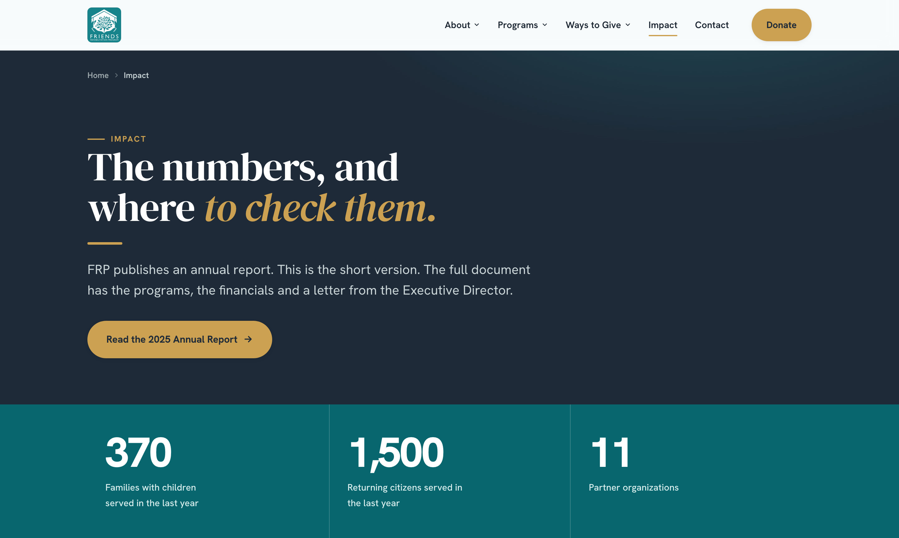
- ↳Structured twelve pages across About, Programs, Ways to Give, Impact and Contact
- ↳Wrote and shaped the copy so each program and each fund reads plainly
- ↳Built the site as a static front end with a page-build script
The people behind the work
- ↳FRP leadership and staff
- ↳A direct client relationship
// Key decisions
Lead with the mission, not the name
The name reads as treatment; the work is housing, re-entry and job training. Rather than explain the name, the hero says what FRP does in two sentences, and the three programs are named in the first screen.
An institution's identity
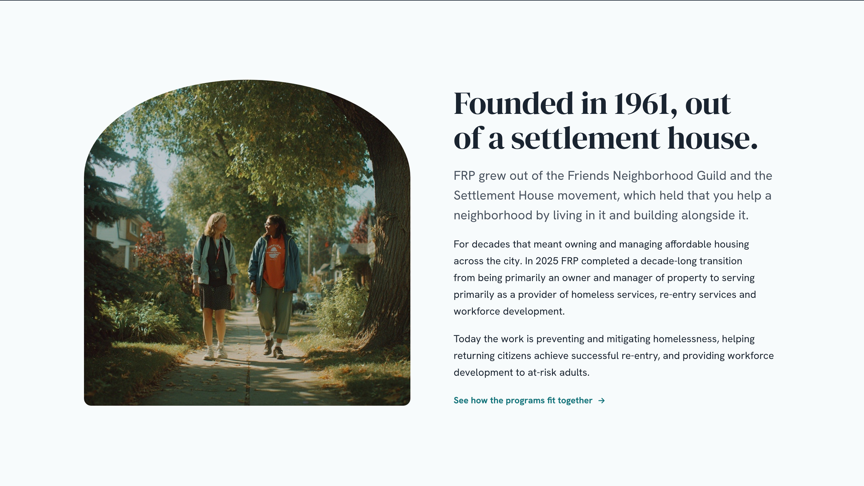
Sixty years of Quaker practice earns gravity. Navy, gold, a serif display face and one arched photograph give the site the bearing of a long-standing institution rather than a small nonprofit's theme.
Give to something specific
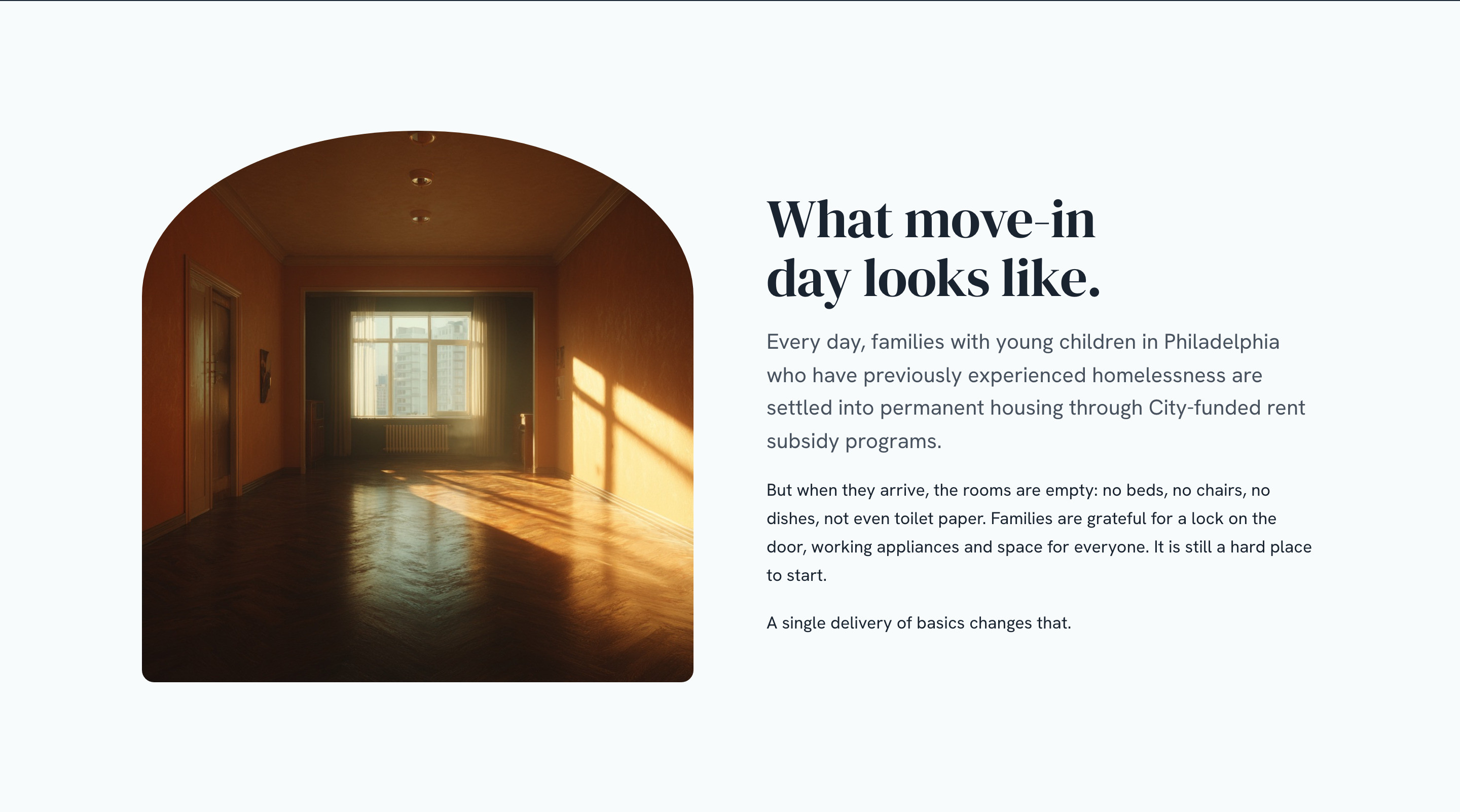
A general donate button is easy to ignore. The Housewarming Fund and the Homeownership Fund each get a page, a story and an ask — so a gift has a shape, and a donor knows what it does.
Numbers with a source
The Impact page shows three figures and links to the annual report they come from. Credibility for a nonprofit is being checkable; the page says so in its own headline.
// The outcome
- ↳A twelve-page site with a clear identity, three programs explained plainly, and two named funds to give to
- ↳In final review with FRP's team ahead of launch
- ↳The first refresh remains live at friends-frp.org until cutover
// Reflection
The first pass fixed how the site felt. This one fixed what it said. The biggest move wasn't visual — it was putting homeless services, re-entry and trades training in the first screen, because a visitor who has to work out what you do won't stay long enough to give.