// 03 — Public Health Campaign
Important! Colorado
Telling Colorado's Medicaid members: check your benefits.
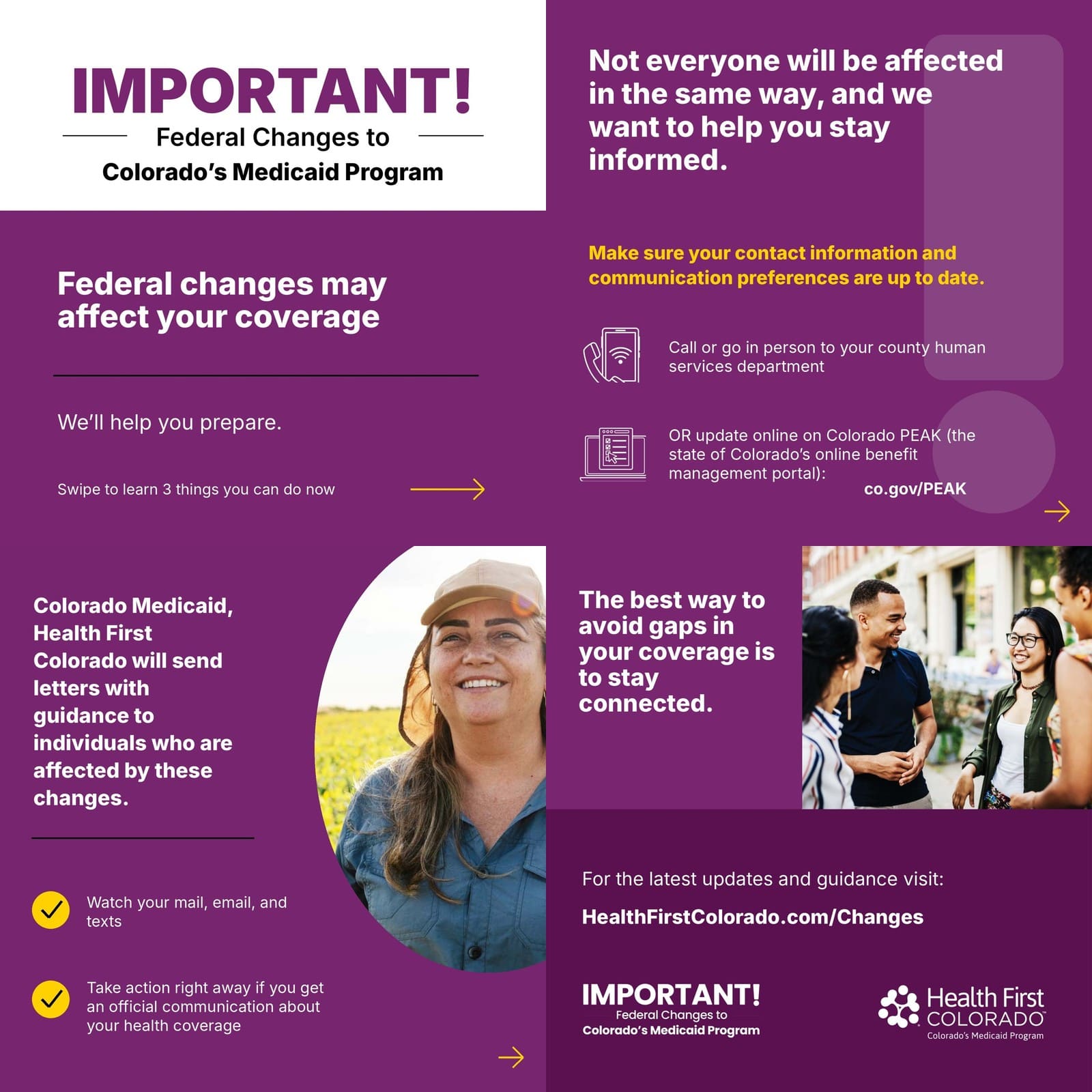
// The brief
A wide-reaching campaign for Health First Colorado — Colorado's Medicaid program — warning members that federal changes could affect their coverage, and urging them to check their benefits information. It began in late 2025 and runs through 2026. I created the 'IMPORTANT!' wordmark and am helping build the print and digital tactics that carry it.
// The challenge
Health First Colorado needed to reach Medicaid members statewide with an urgent but clear message: federal changes could affect your coverage — check your benefits information. It had to cut through and be understood fast, across a broad and varied audience.
A public-health message with real stakes for members' coverage, a wide statewide audience, and a multi-phase rollout (late 2025 through 2026) spanning Jumping Fish and the Health First Colorado team.
// The work
// The mandate
Working through Jumping Fish, help create the campaign that carries this — starting with a wordmark that could anchor everything, then the print and digital tactics that communicate the change.
// John's role
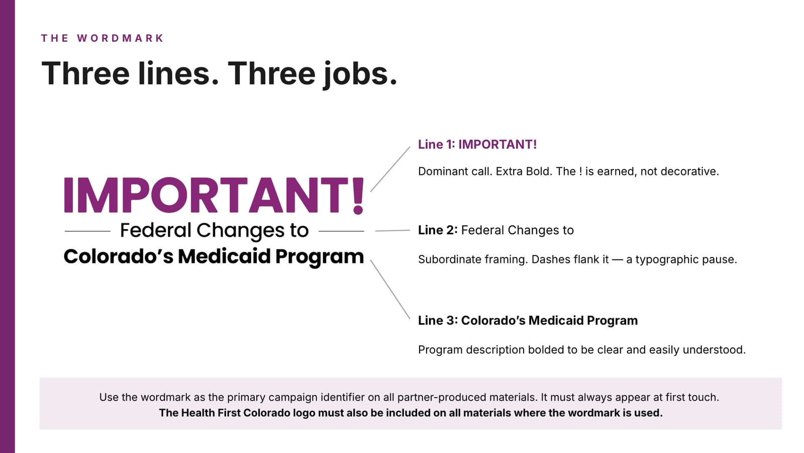
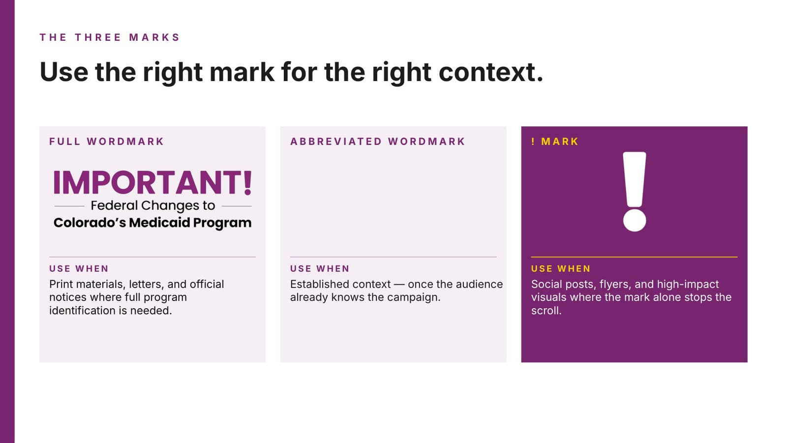
- ↳Created the 'IMPORTANT! Federal Changes to Colorado's Medicaid Program' wordmark — a logo that works as a standalone graphic and as a headline across pieces
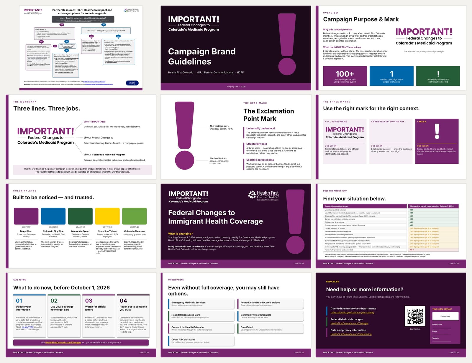
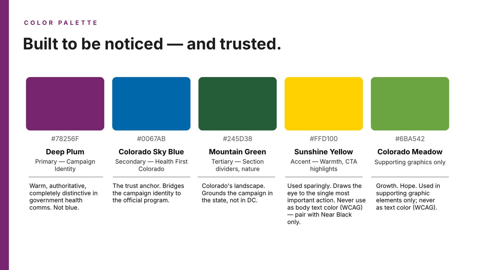
- ↳Wrote the campaign brand system: mark architecture, colour, typography, imagery, and template anatomy
- ↳Designing the print and digital tactics that communicate the change
- ↳Working with Jumping Fish (agency of hire) and the Health First Colorado team
The people behind the work
- ↳Jumping Fish — agency of hire
- ↳Health First Colorado — client team
// Key decisions
A wordmark that doubles as a headline
Designed 'IMPORTANT!' to work two ways — as a singular graphic mark and as the headline on graphic and print pieces — so the campaign has one recognizable anchor everywhere it shows up.
A mark that needs no translation
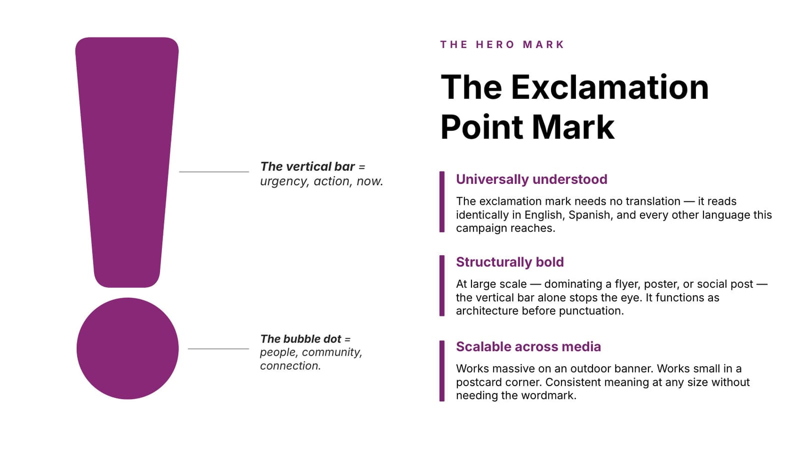
The audience is statewide and multilingual, so the hero mark is an oversized exclamation point — understood identically in English, Spanish, and every other language the campaign reaches. At large scale the vertical bar alone stops the eye; it works as architecture before it works as punctuation.
One system, 100+ partner organizations
Over a hundred partner organizations produce materials under this campaign. That only holds together with a governed system: three defined mark variants with rules for when each applies, so the campaign stays recognizable whether it's a state mailer or a county flyer.
Build accessibility into the palette, not onto it
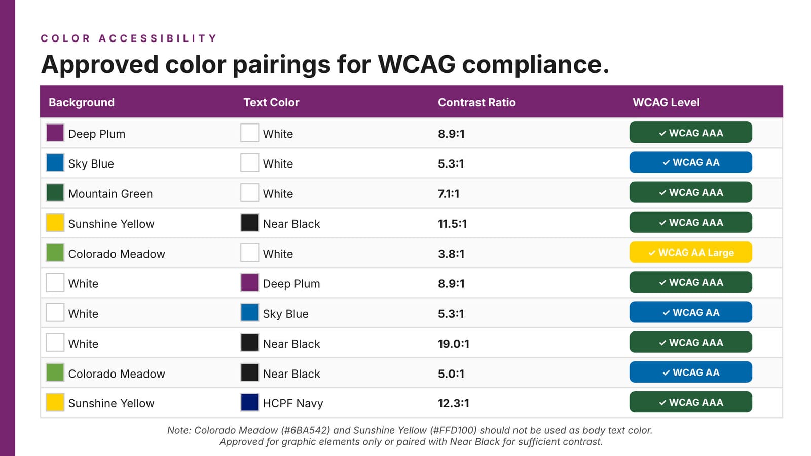
Every colour pairing is specified with its contrast ratio and WCAG level, and the two brightest colours are restricted to graphic elements rather than body text. On a public-health message that people need to read under stress, legibility is the message.
Design for translation from the first layout
Spanish translation is handled downstream by the state, so templates had to be built translation-ready — copy blocks that tolerate expansion instead of layouts that break the moment the language changes.
// The outcome
- ↳A full campaign brand system — mark architecture, palette, typography, imagery direction, and template anatomy — governing 100+ partner organizations
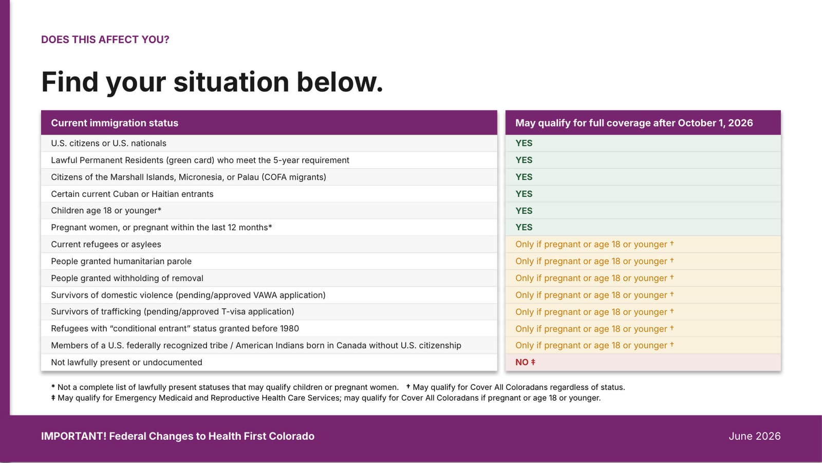
- ↳Phase 2 shipped: member-facing social carousels, immigrant-coverage slides, and a partner eligibility flowchart
- ↳Rolling out statewide since late 2025; currently Phase 2 of 3, ending with a video
- ↳TODO: Confirm reach and response figures once the campaign completes
// Reflection
TODO: Add a reflection once the campaign wraps — it ends with a video I plan to package here in a portfolio-worthy way.